Category Archives: Uncategorized

Holiday cheer

Urban place making through signage

As we reported recently, Southpace Properties won approval to install a large, illuminated projecting sign at their downtown location on Richard Arrington Blvd. North and Third Avenue. It just went up. A great addition to the urban streetscape, and a harbinger, we hope, of better times for commercial real estate here and around the country.

Thanks Southpace!

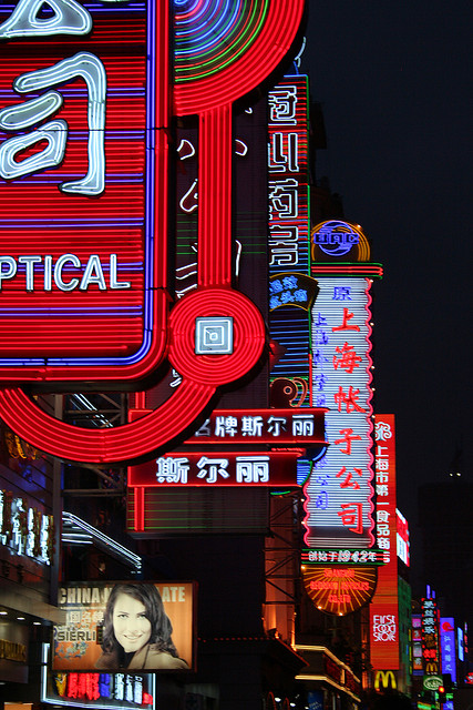
POSTSCRIPT: not there yet, but one of our readers pointed out that this type of large, neon sign is reminiscent of the type of signage you see on Shanghai’s famous shopping street, Nanjing Road. I’ve been there, and it’s indeed amazing at night. A shot below:

Neon writ large

Hopeful

Re-purposing an old neighborhood

Central Woodlawn — a few minutes’ drive (or future tram ride!) east of downtown Birmingham — is a superb example of urban place: well-scaled commercial storefronts, memorable historic architecture, a mixture of wider and narrower streets, and short blocks. This once-busy retail and business center has lost tenants and foot traffic over the years, but the fabric  largely remains. Main Street Birmingham, a non-profit dedicated to revitalizing neighborhoods, has recently renovated a row of one-story storefronts into 55th Place Arts, with low rents targeted to artists (above, on 55th Place North). This city has been too slow to recognize the key role artists can play in urban revitalization; the Phoenix Building downtown (which we developed and designed), with its 74 live-work units of which 60 are subsidized and targeted to artists, is perhaps the only other comparable project in town.

It's all about the fabric

The corner of the project at 55th Place and First Avenue South is seen above, with the entrance to the new City Arts Boutique. Note the fine texture of the buildings along 55th Place, and the easy pedestrian scale of the environment.

Adding color can be literal too

Besides reactivating the street with new businesses and artistic energy, we really appreciate the paint job on the facade, illustrated above. Rather than the standard, conservative browns and grays painted evenly across a surface that you tend to see around town, playful angles and varied tones suit the reconstitution of these storefronts into artist workspace. Kudos to Main Street (and to the Design Review Committee, which today approved new signage and door treatments for the project) for allowing color to be used creatively here. It looks super.

If only the corner had been handled more sensitively

Just down the street (at First Avenue South and 55th Street North), Smiles for Keeps–a dental clinic for children and teens–is building a new facility on a prominent corner site, currently asphalt parking. Above is a rendering (architect: John Holmes), showing the new building with a landscaped area at the corner, and a proposed future building just beyond. A good deal of parking will remain at the rear. Clearly, reclaiming any piece of asphalt parking for a new building is a good thing; on a corner it’s even better. It’s good these buildings have relatively generous storefronts to allow transparency, and that they come to the sidewalk line along 55th Street. What’s less satisfactory is the resolution of the corner itself; while the intent was to mimic the corner entrance at the building currently leased by the clinic around the corner, in this case the “corner entrance” isn’t actually at the corner of the lot. The left-over green space feels just that–left over–and one wishes there were some way to extend the mass of the building out to that corner.

Back on First Avenue North, the corner feels resolved

Above is the historic Woodlawn building currently occupied by the clinic, with that original corner entrance that works seamlessly with the site. Despite this gripe, overall it’s great to see what Main Street Birmingham has been able to encourage in terms of neighborhood investment and even “buzz” about the cool factor represented by the potential in this neighborhood. Working with minimal staff and very tight budgets, this non-profit is on to something here. We wish them, and Woodlawn, much success in the future.

[thanks to John Holmes for the rendering]

Building blocks

How long will YOU walk for that cup of coffee

Over at Fast Company’s Co.Design is an interesting dialog about how important it is for cities to figure out what their fundamental goals are. While this sounds basic, governments, planning agencies, and citizens can get too wrapped up in individual difficult issues; without having big-picture guideposts, solutions to these issues can be disconnected or even harmful. The article is a discussion between a city planner in Gainesville, FL and an urban designer from Perkins + Will, the global design firm.

Same reality, different perception

One of the topics discussed–and one mentioned on this blog previously–is the importance of perception in the urban environment. Above is a diagram of a portion of Manhattan from the article, making the point that if you’re standing at Lexington and 32nd, and a friend calls to say “meet me for coffee at Lex and 42nd”, you’d start walking the short 10 blocks without hesitation. If that same friend says “meet me at 6th and 32nd”, despite the fact it’s exactly the same distance, you’ll brace yourself for a less amusing crosstown schlep. Why? Short blocks with more intersections to cross mean more diversity and visual interest; long blocks with fewer intersections mean less diversity and more visual monotony.

The same could be said for blocks containing empty storefronts, parking lots, few awnings or projecting signage: it becomes a chore to walk. It becomes a delight to walk when you’re visually stimulated on a regular basis along the route. You think less about the distance, and more about the pleasure of being in the street. Food for thought as you think about your next cup of coffee.

[thanks to Co.Design for the diagram]

Sharpening the edge (2)

Transit as a positive image for the street

A reader alerted us to an interesting streetscape project, on Euclid Avenue in downtown Cleveland, OH. This east-west spine is roughly similar to 20th Street in downtown Birmingham, in the sense that it connects the Central Business District at one end to a university (Cleveland State) district at the other end, before it continues into the eastern suburbs. A new Bus Rapid Transit (BRT) line (stop and dedicated lane pictured above on Euclid Avenue in the CBD) has been built as part of street improvements planned to better link the east and west sides of Cleveland’s downtown. This is similar in concept to a proposal prepared by the Regional Planning Commission of Greater Birmingham, whose In-Town Transit Partnership study envisioned BRT serving as a catalyst to downtown development and knitting together the north and south sides of the central city. It’s worth looking at just to drool over the highly inspirational video created as part of the study.

University edge gets urban

Opened for about 3-1/2 years, the $200 million transit redevelopment has ushered in over $3 billion in new/proposed redevelopment, including the University Lofts project shown above, a combination of restored historic buildings and new infill along Euclid adjacent to Cleveland State campus (architect: City Architecture).  The infill building is second from the left: restrained in tone and detailing, with proportions that align to its neighbors. This is a great example of how a well-done transit project, and urbane mixed-use development that accompanies it, can result in a vibrant edge for an urban campus.

Transit used to be part of the fabric

Above is 20th Street at Five Points South in the 1920’s–with prominent streetcar lines connecting the district to the north side. A potentially thriving edge of UAB‘s campus, it would benefit tremendously from better transit connections, and from university and private mixed-use development that adheres to solid tenets of urban design. Cleveland, and Cleveland State, seem to have gotten it right; let’s learn from their example!

[thanks to fitchdnld for the Euclid Avenue CBD pic; city architecture for the Euclid Avenue campus stop pic; photonut2 for the Five Points pic)

Play ball (2)

And it's happening

The City’s Design Review Committee conditionally approved demolition of an area just south of Railroad Park to prepare for construction of the new ball park of the Birmingham Barons. The area, pictured above, is four square blocks bounded by First Avenue South (facing the park) and Third Avenue South, and 14th and 16th Streets. The hatched buildings will be taken down; noticeably unhatched is the B&A Warehouse building at the corner of 16th and First Avenue, no longer part of the project.

Conceptual--with the hope of solid urban edges

Brian Wolf of Corporate Realty presented the 2 simple documents–the demo plan and the concept ball park plan, above. The Committee’s main objection was the lack of even schematic drawings illustrating the nature of the street edges of the project. Committee member Cheryl Morgan stated her concern about the importance of the 14th Street corner, and the need for parks to have active, vibrant edges. The rest of the Committee had similar concerns. Mr. Wolf assured the Committee that much time and effort has been put into creating an active street edge, and that he’d come back in January with completed schematics showing this. In the end, given the fast-track schedule and the scale of the project, the vote was to allow only partial demolition to occur, with the remainder waiting until schematics are presented in January. The main concern of this blog has been similar to the Committee’s–having a backside of a ball park fronting a major public park is not good urban planning. That we will get even a small buffer of pedestrian-scaled architecture between sidewalk and ball park is hopeful.

Big improvement

About a year ago we posted on the unfortunate deterioration of an aging strip center in Five Points South at the corner of 19th Street and 11th Avenue South. A massive “Bail Bonds” sign that had gone up without Design Review permission seemed to symbolize the challenges of this historic commercial area’s struggle to rejuvenate. This morning, the above proposal was unanimously passed by the Committee. All existing (and mainly non-conforming) signage will be removed, and a new red sign band created to provide a unified appearance. Needless to say, there was practically cheering in the aisles. (Cohen, Carnaggio, Reynolds are the architects).

More urban amenities = good

Last but not least, the above shows a major renovation of historic structures at the corner of 6th Avenue South and 22nd Street South into a music performance space and lounge, able to hold up to 1000 patrons (design by TRI Architecture and Interior Design). Located within the same block as Workplay, across the street from the Fish Market, and adjacent to the Liv on Fifth lofts, this is a major investment in downtown entertainment. Healthy cities have lots of entertainment options that make urban places attractive to the coveted younger demographic of people in their 20’s and 30’s. We wish Iron City Live Music Hall much success, and hope it inspires additional development in the area.

[thanks to Corporate Realty for the ball park plans; Cohen Carnaggio Reynolds for the Five Points rendering; and TRI for the Iron City Music Hall elevations]

Good cities have…

It really is a different world up there

…good transportation options. From the hallowed halls of Tufts University, our friend Amos Wright is working on a study of Birmingham’s transit situation, and has posted a quick survey over on his heaviest corner blog. Amos,  living in Somerville, MA while he’s doing graduate work in urban planning, has the luxury of using Boston’s terrific transit options (from his local “T” stop above, to a vast network of bike lanes and greenways). We in Birmingham are less fortunate when it comes to transit.

But anyone who values the opportunities good transit can bring a city, consider taking a few minutes to complete his survey here.

Happy Thanksgiving–and safe travels to all, regardless of your mode of transport.

[thanks to TommytheLion for the Davis Square T stop pic]

Buen apetito

It's almost here

After much anticipation, the new restaurant in the 2200 block of 2nd Avenue North, El Barrio, is poised to open the first part of December. The owners of Trattoria Centrale, a few blocks east, plan an innovative, energetic, foodie type of a place with cuisine inspired by all regions of Mexico. Picture a younger Sol y Luna, but with a much bigger kitchen (and therefore a more diverse menu). We give you a sneak peek at the design of downtown’s newest culinary attraction.

More foot traffic coming

Above is the storefront, in the former Storkland store; you will notice the hostess stand (temporarily outside) made from leftover concrete from a core drill on site, with rebar twisting up to hold the “book”. Design was a collaboration between KDAG Designs and Appleseed Workshop, with Appleseed not just handling general construction, but also custom building many of the interior elements like the stand. Outdoor seating will be installed at the sidewalk.

Explosion of latin vibe

A visually arresting feature of the main room is local artist Shane B’s full-wall mural (above, with a half-built banquette underneath; Shane B can be found at Non Stop Art around the corner on 20th Street). A riff on urban street art, it should set the mood for botanas (Mexican street snacks that are part of the planned menu).

Not complete without a bar and a lounge

Opposite the mural is the long bar, seen left in the picture above. To either side of the storefront entrance is a small stand-up drinking area, and a larger lounge area with built-in banquette and kidney tables designed for the space (below). Reclaimed wood and original, historic materials mix with new steel and concrete accents in an eclectic, “vintage” way.

Made from scratch and awaiting it's glass inserts

El Barrio plans to open initially just serving lunch, while they await their liquor license to get final approval (expected early January). At that point, the restaurant will be open every day for lunch and dinner (until 9 on weeknights, midnight on the weekends), with happy hour bar specials as well. Owner Brian Somershield emphasized that he wants dinner to be a full experience, including Latin American wines picked especially for the cuisine, seasonal fresh fruit margaritas, etc. So while we’re eager for evening service, we’ll be happy to enjoy lunch until they’ve got the bar ready to go.

Ensuring every detail is correct

As anyone who’s eaten at Centrale can attest, these guys are serious about details (above foreground, owner Geoff Lockert inspects new kitchen equipment). While the food and drink should be fresh and innovative, they also want the atmosphere to feel warm and accessible. Servers and bartenders are being chosen as much for their demeanor and passion for food, as for their experience (a similar concept to Centrale).  The chef, Neville Baay, was chosen due to his culinary skills of course, but also because his philosophy matches that of the owners. It should make for a good combination.

And also coming soon?

And why does this restaurant matter–besides giving us another dining option, of course? First, it should extend foot traffic and street life east from the 2300 block, enlarging the nucleus of retail, restaurant, and bar activity there. Second, it should become an anchor for its block, encouraging others to follow. For instance, above (middle storefront) is a recently rented space which is planned as the District, a bar serving late-night tapas–directly across the street from El Barrio. We can’t report much more about it yet, but it’s an example of how most businesses like to congregate around other similar businesses. It takes some initial pioneers, and then hopefully–with the right conditions and context–others follow, and then you have a real district. In other words, we’re ready for tacos!

Sharpening the edge

Building a case for more amenities

Week before last, the University of Alabama System Board of Trustees declined to include on their meeting agenda UAB‘s proposal for a new on-campus football stadium (shown schematically above at the corner of  13th Street and 6th Avenue South). It seems that despite a seemingly conservative business plan put forward by UAB, and good community support (all luxury skyboxes were rented for 5 years), the stadium, for the moment, won’t be built. While I personally hope the BOT will reconsider and move forward with the stadium, this is a good time to have a brief look at the UAB Master Plan, of which the stadium is a part.

The footprint says it all--big impact

UAB is the largest employer not just in Birmingham, but in the state; it’s impact is immense. All those employees, faculty, and students (as well as the health system complex) are on a Southside campus not much more than 40 years old. The recent Master Plan update (prepared by KPS Group, above)–which is part of a broader UAB strategic plan–shows proposed new construction and green space. The full master plan document states the following as a primary goal: “Encourage Midtown and Five Points town/gown mixed use development and foster interconnection of the campus with these areas.” My guess is this is the first time such a definitive statement has been officially included in a UAB master plan. The timing could not be better.

Critical mass, needs more permeability

Above is 19th Street looking north from 9th Avenue South. Historically, many UAB campus buildings have been impressive in terms of bulk, but are missing key links to the street; in place of welcoming entrances and transparencies, one often sees solid brick walls or immense mechanical vents. Or parking decks with no ground floor retail or contextual facades. The current administration, in part through the master plan, is making an effort to correct these issues by encouraging the “interconnection of the campus” with the surrounding neighborhoods. Rather than only considering buildings as discreet elements, serving  occupants and internal functions, UAB is committed to ensuring its buildings and green spaces tie into pedestrian/bike corridors, relate to existing/proposed neighborhood context, and otherwise weave into the surrounding city. The university’s plan is more extroverted than in the past, a needed quality given the nearby proposed private development around Railroad Park, in Midtown, and in Five Points. That edge–where campus buildings meet public streets and adjacent neighborhoods–is one of the keys to the plan’s success.

Mixed use for happy students

Several universities have taken on the “edge” of their urban campus in innovative ways. One example is Ohio State University (main campus at Columbus), which built the Campus Gateway project several years ago (above). This is a mixed-use complex where parking lots and other underused land at the fringe of campus were reformulated into a 4-block, mid-rise node including housing, office space, retail, restaurants, and a cinema. Extensive time was spent with many parties–from students, to employees, to neighborhood residents–before coming up with the desired mix, density, etc. The result? A rejuvenated neighborhood north of downtown Columbus (existing, adjacent historic commercial structures have also been renovated), a happier university community with dining and entertainment options right next to campus, and an improvement in the “town-gown” relations of Ohio State. In other words, a win-win for everyone. [note that Goody Clancy, the Boston planning firm, was hired by Ohio State to design the Gateway project. This is the same firm leading the current Comprehensive Plan for the City of Birmingham].

Despite the football stadium’s current woes, there is much that UAB’s master plan could do to strengthen the existing Five Points commercial district and foster new growth in Midtown and at Railroad Park. With the right amount of smart thinking and strategic implementation, the university can create exciting urban places that improve life on campus–and in the City.

[thanks to intellidryad for the 19th Street pic; ifmuth for the Gateway pic]

A tale of one city

Your future is waiting

Above is a map illustrating the 6 public input meetings to be held over the next weeks to help produce the City’s new Comprehensive Plan. Interested in the future of this City? Come to the meeting corresponding to your own neighborhood where you live (or work or play). Feel free to go to more than one if you’d like–all are welcome!

Make sure you check out the Comp Plan’s website for lots of interesting data, maps, and (coming soon) draft reports,  a collective vision, and strategies for implementation–how can you not want your voice to be heard?

[thanks to City of Birmingham and the Comprehensive Plan team for the image]

A little history (2)

Design worth preserving

In an earlier post, we discussed the colorful history of the area around the current Regions Bank in the Lakeview District (3rd Avenue South and 32nd Street, above). At the time Barber Companies was regrading vacant land across the street into parking; they have since started construction on a new office building, a hopeful sign this urban neighborhood will continue to see investment and revitalization. The start of the new building is seen below, across 32nd Street from the bank.

Underway courtesy of Barber

This morning at the City’s Design Review Committee, Regions presented a request to demolish the existing drive-through canopy at the rear of their building, and replace it with a new one. The existing canopy is very visible, since it faces the bank parking lot which extends to the alley; in effect the rear facade is almost as important as the front given its high level of exposure. The Committee denied the request, and asked for Regions to return with a revised proposal. Why?

It's all about proportion

As seen above, the existing drive-through canopies (to the right) mimic the thin, light effect of other canopies on the building. You can observe this characteristic at the angled canopy to the right on the front facade, or at the back entrance to the left of the drive-through. That lightweight quality in projecting architectural elements is typical of this sort of “Miami Modern” architecture.

The proposal removed the existing staggered canopy system and replaced it with a singular, heavy-set canopy that’s identical to what one sees at a typical gas station. Instead of the perhaps 8-9 inch height of the current canopy, the new one was to be 36 inches high, ostensibly to hide the pneumatic tubes that are currently exposed. Committee member Mark Fugnitto eloquently defended the architectural merits of the building, and asked that Regions put some thought into designing a canopy that’s consistent with those merits.

Hard to win anyone over with this

The other issue with the presentation was the lack of basic presentation materials. Rather than a set of good, illustrative drawings and (preferably) a rendering, only a photo (similar to the above) was presented of a generic, gas-station-like canopy from some other location. The Regions building does not rise to the level of being iconic, but it still serves as a very good example of this period of commercial architectural history. The Committee was absolutely right to insist on a more professional, and thoughtful, effort from the bank.

[thanks to rocketdogphoto for the gas station canopy]