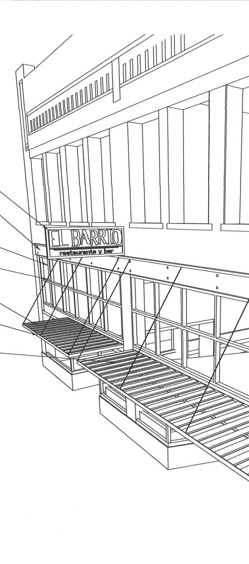
As reported in the last post, the Design Review Committee refused to vote on the proposed projecting sign advertising the new El Barrio restaurant in the 2200 block of Second Avenue North (sketch shown above). The Committee has been gradually giving more support over the last 10 years to projecting signs, which became symbolic in the 1970’s and early 80’s of urban “blight” and “messiness”. Back then, urban planners and designers tried to eliminate this type of projecting “blade” sign, and replaced them with surface mounted signage which mimicked retail signage you’d find in enclosed suburban malls–a fashionable paradigm at the time.
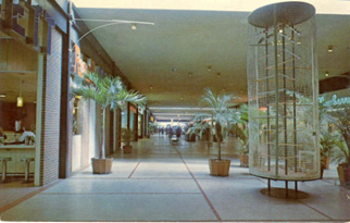
This suburban paradigm (illustrated above in a 1960’s photo at the original Eastwood Mall in Birmingham) was a product of strict control: malls are private enterprises, and signage along with other aesthetics had to conform to specific guidelines. Color, size, illumination, font, and verbiage were all subject to approval. This was different from the situation in older urban cores, where a lack of control over multiple ownerships resulted in a great diversity of signage. Historically, projecting signs to draw attention to businesses were a fundamental part of the visual landscape.
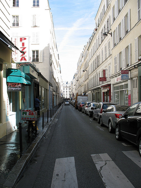
Even mundane signage (like that above in a narrow Parisian street) enlivens the pedestrian route down a street, alerting you that “something of interest” lies ahead. It also acts as a traffic calming device, making drivers slow down a bit as their peripheral vision takes in the signage around them.
More functional signage is seen at this London intersection above. Imagine this same scene without the projecting signs, and some of the charm disappears.
Above is a development in downtown Stockholm, where the developer insisted that all retail tenants have well-designed projecting signs, which share a size and good graphics, but otherwise are distinct and eye-catching.
Closer to home, another historic street is Royal Street in New Orleans, whose proliferation of signage is part of a recognizable fabric–and one beloved by many. Historic districts like this today encourage–even mandate–the use of tasteful, well-designed projecting signs because their value as an intrinsic part of the street experience is appreciated, and has been (explicitly) for years now.
Contrast the vibrancy of the previous photos with the above image of 2nd Avenue North in downtown Birmingham, looking east from 20th Street. The lack of projecting signs (or awnings, or cafe tables) makes for a lifeless, dull, less-than-enticing prospect. Unless you are very familiar with the street and know where you are going, what stimulates you to explore? Not much. A lot of this is the result of Birmingham traditionally making it difficult, since the late 1970’s, to erect projecting signs.
Fortunately, as mentioned earlier, Design Review has been a bit more supportive each year in the last decade of approving projecting signs, to the point where–much to my relief–I’ve grown to count on them for approving projecting signs, as long as they’re thoughtful and tasteful (above is the projecting sign we designed for the Phoenix Building loft project back in 2005, which provides a welcome bit of light and whimsy on an otherwise distressed piece of street–note the ruined sign box across the street which has been in that condition for a decade). This is why I was quite surprised that the relatively small, non-illuminated sign for El Barrio received a lot of criticism, using as a reference point an early 1980’s argument about sanitizing the streetscape. It felt like a time warp.
A recent approval for a projecting sign was for Urban Standard, just a block down the street from El Barrio (above). This popular coffee shop wanted to clearly show pedestrian and auto traffic where their business is, and this sign works well. The busier this block has become, the less likely people park in front of a business–they often walk from some distance, or park on another block. Projecting signs are an excellent way to orient visitors and residents alike. I have personally witnessed visitors to this block with Urban Standard hesitate before crossing to the next block–they squint, looking, literally, for a sign of interest: is it worth our while to keep walking? To connect El Barrio with the energy of 2nd Row, people need that visual connection. The sign needs to be approved.
Projecting signs (the 2nd Row sign we designed in 2007 is above) are crucial to any healthy urban street environment. They can be expensive, and time-consuming to install (the City legal department has made it more difficult to get the final permit for anything projecting over a public way, beyond approval of Zoning or Design Review). If a business owner is willing to put time and money into a well-designed sign, we should be encouraging them to do so to enhance our built environment, rather than discouraging them by using outdated, suburban-inspired principles from 40 years ago. I hope the applicant will make another case for the sign, and get approved next time. To anyone interested in improving this town, it’s a no-brainer.
[thanks to Appleseed Workhop for the sketch; akeley for the London pic; Matthew Zimmerman for the Stockholm pic; Jon Barbour for the Paris pic; MVI for New Orleans pic; birminghamrewound for the Eastwood Mall pic]


As a small business owner in downtown Birmingham I would love to see more signs readily visible to passing cars. When we were located on 20th street we heard daily that it was hard to find us–bow that we have moved to a new location with more visible signage (albeit not projecting) our sales have gone up. isn’t tax revenue vital for Birmingham?? We need to stop pretending we are a charming southern city and face the reality we are a growing city in need of even more growth and look ahead rather than being rooted in some outdated notion of quaintness and charm
Guidelines should indeed encourage better visibility for our merchants. Other cities have figured this out; we sometimes seem stuck in an outdated era, as you state. Not everyone, but some.
How can they refuse to vote on it?
They delayed a vote until the applicant returns to discuss it again. My guess is the 2nd time, they’ll have to vote. I didn’t see any good reason why they delayed it the first time.
I do not see any good reason for them NOT to approve it! As we all know, there have been numerous other projecting signs approved by the DRC lately. the precident has been set.
Exactly–this initial (and I hope temporary) refusal seemed to come out of left field.
A good argument. This was initially a valid response to truly awful clutter and signs that completely obscured the buildings’ architectural features. With proper sizing, placement and limited number projecting signs can do what you say. On the other hand, the level of control might vary by street or district. One example: Times Square compared to Rockefeller Center a few blocks away. I recently read in the AIA NYC Guide that the Fifth Avenue Association restricted projecting signs starting in the 1920’s (along with other street clutter) to set a quality tone consistent with the grand houses — many now used as stores near Saks.
Great point–different districts have different characters, and the signage should reflect that. 5th Avenue in NYC is an interesting example of that rare street where the architecture is so grand, the shops so well-known, and the address so internationally recognizable and constantly thronged with foot traffic, that projecting signs aren’t as necessary.
This took me forever to find, but I think it’s a project you’ll find interest in.
http://pulse.media.mit.edu/
Fantastic site. Worthy of sharing in a post! I appreciate it.
@ philip I think you would be very hard pressed to identify any “grand houses” anywhere on Fifth Avenue. There is the Frick Collection, which is no longer a residence and which was saved from destruction due to some rather unusual circumstances. the only ‘grand house’ I can think of which is still being “used as a store” anywhere near Fifth would be the RL store on Mad at 72nd.
@ jeremy also the pictures you have used as illustrations are sort of like the “before” and “after” in a diet ad where the woman “after” is not only thinner, but has a new hairstyle, whiter teeth, etc.
The problem with e.g. Second Avenue vs. Royal Street NOLA and whatever-gatan in Stockholm is that on Second Avenue, every time the light changes you will have two or three rows of cars whizzing past you.
Imagine passing the projecting signs in Stockholm at Second Avenue speed – it would be like watching a flipbook. The good projecting signs are to some extent determined by the “built environment,” including the width of the streets.
A valid point that you and others have made is that the type/size/quality of projecting sign should be adjusted depending on the type of district, size of the street, traffic speed, etc. As to Second Avenue specifically, I think a lot of what we’re trying to do is in anticipation of the City’s planned conversion of the street from one- to two-way traffic, installation of bike lane, etc. Whether that happens in our lifetime is another matter, of course. Thanks for your comments!
I especially like the ones in Stockholm. There is a sign, however, behind your building that doesn’t seem to fit the architecture. But what do I know?
Which sign do you mean exactly? Thanks.
It seems to be a CPA or law office in a style sort of like what would be seen in NOLA.
That’s a CPA office in the former Fire Station No. 4. We designed that sign, as well as the exterior rehab generally. You are right in that it’s unusual for a CPA to want that type of signage, but to their credit they wanted to visually link their business to the energy along 2nd Avenue. We kept it as slim as possible and over to the corner, so that it’s clearly secondary to the wonderful architecture of this building.
I’m just greatful for any building that is redone instead of leveled for parking!! That particular one is BEAUTIFUL!!! Good job!
Thanks so much, we appreciate it!!
Hearing this surprised me. Didn’t The Metro Bar just have their new projecting sign approved? Any prediction as to whether it will pass next time around?
Surprising indeed–Metro Bar has their new signage out, though I must have been out of town when it was recently approved. Regardless, there has been a consistent pattern of approving thoughtfully designed projecting signs which is why this move was so unexpected. I’m an optimist by nature, but I do think it will pass the next time around. Thanks.
Pingback: El Barrio’s Wildly Controversial Sign | Counts Bros. Renovation
Fingers crossed. Thanks for the update!
These small signs represent a focus on pedestrian oriented design and hopefully represent a city that is interested in promoting walking. All of your images represent that very well (as in, none of them were taken from a car.) It’s wonderful to see them coming back and I hope they continue to appear all over the city.
Projecting signs should be considered as promoting walking and pedestrian security, and part of the list that would include street furniture, widened sidewalks, planting, banners, lighting, etc. Of course transit and bike lanes are an important part of the equation, and this City is woefully behind the curve on both.
Among many small businesses, Birmingham has a bad reputation for red tape in all aspects of opening shop, not just signage. It would be nice to see Mayor Bell take the lead in making the city more “customer friendly” towards those who are willing to put their faith in the city.
You are right that there are even small things that a Mayor can insist on, that could make a difference in terms of business/citizen satisfaction. In any city, a Mayor is only as strong as the bureaucracy, and it’s tough to change an institutional climate without years of cultivation.
Jeremy- how close to retirement are the department heads managing all this at City Hall? Are younger, more thoughtful people being groomed for these departments? Are these departments just pay check dispensers?
It seems Birmingham needs a “corporate culture” makeover, if you’ll pardon the term. Still, baby steps are being made, and your posts continue to keep this debate in the public forum. Thanks!!
Hi Todd, certain department heads are certainly getting up there; some very smart young people are also getting hired/groomed. One issue is that so many decisions/policies are inter-related, that multiple departments/offices must all be synched and on board or change doesn’t happen. I’m not an expert in “corporate culture” although I know certain cities have done better than others. And yes, a lot of people just collect pay checks and do a minimum required to get through the day–but this is the nature of civil service everywhere. Finding a way to get enough smart, progressive, communicating people in enough departments to overcome the “pay check collectors” would be the trick. I can’t stress communication enough–the right hand often doesn’t know what the left hand is doing!
Pingback: Design review alert | Bhamarchitect's Blog
I have been surfing on-line greater than 3 hours these days, but I by no means found any interesting article like yours. It is beautiful worth enough for me. Personally, if all website owners and bloggers made good content as you did, the net will likely be much more useful than ever before.