Small, well-designed, yet somehow controversial
As reported in the last post, the Design Review Committee refused to vote on the proposed projecting sign advertising the new El Barrio restaurant in the 2200 block of Second Avenue North (sketch shown above). The Committee has been gradually giving more support over the last 10 years to projecting signs, which became symbolic in the 1970’s and early 80’s of urban “blight” and “messiness”. Back then, urban planners and designers tried to eliminate this type of projecting “blade” sign, and replaced them with surface mounted signage which mimicked retail signage you’d find in enclosed suburban malls–a fashionable paradigm at the time.

Squeaky clean and miles away from urban woes
This suburban paradigm (illustrated above in a 1960’s photo at the original Eastwood Mall in Birmingham) was a product of strict control: malls are private enterprises, and signage along with other aesthetics had to conform to specific guidelines. Color, size, illumination, font, and verbiage were all subject to approval. This was different from the situation in older urban cores, where a lack of control over multiple ownerships resulted in a great diversity of signage. Historically, projecting signs to draw attention to businesses were a fundamental part of the visual landscape.

Haussmann's streets get color and variety in part through the signs
Even mundane signage (like that above in a narrow Parisian street) enlivens the pedestrian route down a street, alerting you that “something of interest” lies ahead. It also acts as a traffic calming device, making drivers slow down a bit as their peripheral vision takes in the signage around them.

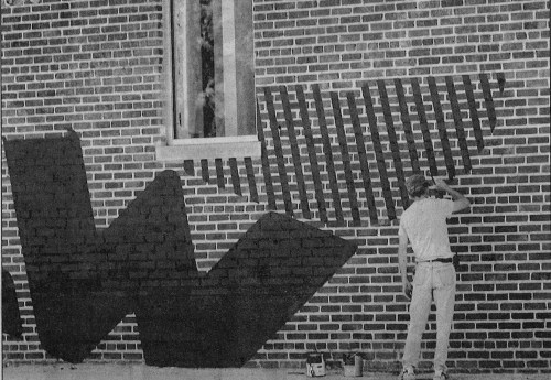
The all-important sign repairman
More functional signage is seen at this London intersection above. Imagine this same scene without the projecting signs, and some of the charm disappears.

Good projecting signs encouraged by Swedes
Above is a development in downtown Stockholm, where the developer insisted that all retail tenants have well-designed projecting signs, which share a size and good graphics, but otherwise are distinct and eye-catching.

Part of a successful commercial street = projecting signs
Closer to home, another historic street is Royal Street in New Orleans, whose proliferation of signage is part of a recognizable fabric–and one beloved by many. Historic districts like this today encourage–even mandate–the use of tasteful, well-designed projecting signs because their value as an intrinsic part of the street experience is appreciated, and has been (explicitly) for years now.

Is anyone there?
Contrast the vibrancy of the previous photos with the above image of 2nd Avenue North in downtown Birmingham, looking east from 20th Street. The lack of projecting signs (or awnings, or cafe tables) makes for a lifeless, dull, less-than-enticing prospect. Unless you are very familiar with the street and know where you are going, what stimulates you to explore? Not much. A lot of this is the result of Birmingham traditionally making it difficult, since the late 1970’s, to erect projecting signs.

A beacon on 2nd Avenue
Fortunately, as mentioned earlier, Design Review has been a bit more supportive each year in the last decade of approving projecting signs, to the point where–much to my relief–I’ve grown to count on them for approving projecting signs, as long as they’re thoughtful and tasteful (above is the projecting sign we designed for the Phoenix Building loft project back in 2005, which provides a welcome bit of light and whimsy on an otherwise distressed piece of street–note the ruined sign box across the street which has been in that condition for a decade). This is why I was quite surprised that the relatively small, non-illuminated sign for El Barrio received a lot of criticism, using as a reference point an early 1980’s argument about sanitizing the streetscape. It felt like a time warp.

Help me find my caffeine
A recent approval for a projecting sign was for Urban Standard, just a block down the street from El Barrio (above). This popular coffee shop wanted to clearly show pedestrian and auto traffic where their business is, and this sign works well. The busier this block has become, the less likely people park in front of a business–they often walk from some distance, or park on another block. Projecting signs are an excellent way to orient visitors and residents alike. I have personally witnessed visitors to this block with Urban Standard hesitate before crossing to the next block–they squint, looking, literally, for a sign of interest: is it worth our while to keep walking? To connect El Barrio with the energy of 2nd Row, people need that visual connection. The sign needs to be approved.

We need more!
Projecting signs (the 2nd Row sign we designed in 2007 is above) are crucial to any healthy urban street environment. They can be expensive, and time-consuming to install (the City legal department has made it more difficult to get the final permit for anything projecting over a public way, beyond approval of Zoning or Design Review). If a business owner is willing to put time and money into a well-designed sign, we should be encouraging them to do so to enhance our built environment, rather than discouraging them by using outdated, suburban-inspired principles from 40 years ago. I hope the applicant will make another case for the sign, and get approved next time. To anyone interested in improving this town, it’s a no-brainer.
[thanks to Appleseed Workhop for the sketch; akeley for the London pic; Matthew Zimmerman for the Stockholm pic; Jon Barbour for the Paris pic; MVI for New Orleans pic; birminghamrewound for the Eastwood Mall pic]