Last night at dinner, my friend K was ranting that she wished we could tear down all of downtown’s “bombed out” buildings…a heated argument ensued, but I get the gist. The empty old buildings weigh more on your eyes than the renovated ones, the new ones. So if we filled all these empty buildings with ground floor activities, that would go a long way to fixing her (and others’) perceptions — if all the buildings were fixed up, but still empty — that would look good, but not get to the goal.
A building in an urban setting serves multiple purposes: it shelters its inhabitants; it welcomes visitors; it facilitates commerce; and it defines the public space outside. It is this last item which concerns a building’s skin: where the surface of a building meets public space. You could argue that a building with an ugly skin could still have a positive effect on public space if this skin is permeable enough–both physically and visually–to encourage lots of human activity at the street (like this rather grim building above in Manchester, UK that nonetheless has continuous retail and restaurant storefronts at the street–thanks to deltrem for the pic). But if a building also has beauty, then it raises the public perception, and instills satisfaction within the viewer. Of course a building that neither encourages human activity, nor provides the casual viewer with a happy feeling–well, that building has problems — and that is what K and a lot of others see all too often.
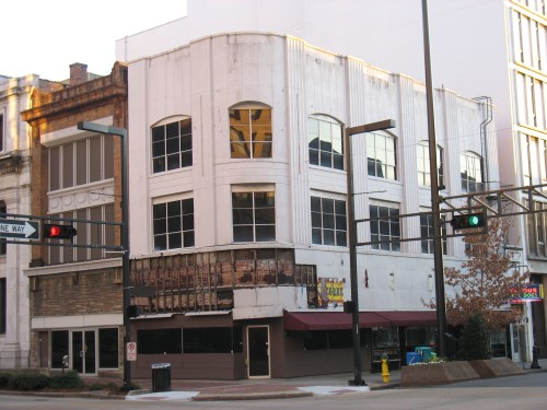
Take for example the building at the corner of 20th Street and 2nd Avenue North downtown, the Webb Building (originally constructed 1871–and among the first brick 3-story buildings in the city).
Owned for years by Southtrust Bank, it has been vacant for a while, and is now privately owned after Southtrust’s successors sold both it and the entire half block it sits in. You would be hard-pressed to find such a prominent corner on the most prominent north-south street in town looking so darn tawdry. Although very small in size, the corner position of this forlorn building magnifies a message to those passing by: no one cares about this corner. Although nearby large office buildings may have occupancy rates averaging over 90%, often that occupancy is invisible, occurring on the inside. What’s visible is this peeling facade, desperate for renovation. This small building ends up speaking louder than an office tower that’s 90% full just a couple blocks away. It’s all about the bad skin.
Just a block down 2nd Avenue is the Pizitz Building, another distressed building that would radio the same depressing message, except for one fact: it’s entire skin, intricate terra cotta and masonry, is slated to be meticulously restored to the standards of the National Park Service in an imminent restoration (more on this project soon). Assuming this project goes through, we’ll get the best of all worlds–both a beautiful skin and lots of human activity in the form of retail and restaurant tenants at street level. People exiting the McWane Center or IMAX Theatre will no longer confront a major symbol of urban blight, but instead a thing of beauty.
And again, beauty makes people happy. Leaves ’em with a smile on their face. That’s what great urban environments do.
All of that facade restoration is often quite expensive, when you’re dealing with old buildings–especially those that have lots of decorative elements in disrepair. When we renovated the Phoenix Building, we were not required to restore the terra-cotta detailing, or remove the paint from the original copper transom frames. The federal Historic Tax Credit program let’s you choose to leave such things alone. But we just couldn’t imagine renovating the building without making it beautiful on the outside again. In the street shot taken before renovation, you can see the copper transom frames painted over, and dirty, chipping terra-cotta details. The detail pic shows how artisans remolded shapes to match the original terra-cotta that had chipped off long ago, and a sample of the copper being burnished and restored.
Back on 20th Street, the Watts Tower was renovated just 10 years ago into apartments, but the skin…not so much. This building, an Art Deco tower designed by local firm Warren Knight and Davis in 1927 (replacing a charming Commercial Second Empire style 1888 building of the same name), derived much of its original, streamlined, simple beauty through the contrast of its vertical brick spandrel/window stripes with terra-cotta at the corners. In 1977, the whole facade was “modernized” by painting everything a bland cream color. When the renovation occurred in 1999, this unfortunate situation was unremedied. Almost worse, certain windows were boarded up on each floor and ugly exhaust vents were unceremoniously stuck in their place.
Add in the lack of a building standard for window treatments, and the lack of anything graphic telling you there’s something new in the building (except for some very off-the rack “for rent” and “for sale” signs)—-and you end up with a very sad looking skin. If I were a visitor looking up at this building, I would guess it was a low-rent apartment building redeveloped in the 1970s, not a high-rent condo building redeveloped just 10 years ago.
K can be tentative about her relationship to an urban environment. Sort of like a residential neighborhood where you see one house abandoned with windows out–it makes K want to keep driving to a better neighborhood. And when K sees one building downtown with bad skin, or several running down a street–this doesn’t make her want to linger. It makes her search for another, happier neighborhood.
OK K. We will get right on it. Better skin in Aisle 2.


