Category Archives: Uncategorized

Urban trekking

Energizing

A great new website called trekbirmingham launched last week. It’s a project of Birmingham-Southern College and is designed by Scout Branding.

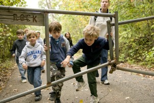
Phase 1 of the project takes 6 trekking destinations across the metro–from Ruffner Mountain (pictured above) to Vulcan Park, and explores their geology, trek-ability, and ecology. All in a thoughtful, well-designed format.

Take a moment to review the site and get excited about all the opportunities to get into nature without leaving the city!

[thanks to trekbirmingham for the pic]

Historic travesty

Shocking

Many of us have experienced losses after the recent tornadoes, or have tried to help those who have. A week ago I traveled to Tuscaloosa to visit some friends, whose house is shown above. It is located in a beautiful historic neighborhood called The Highlands, and it was barely recognizable to me. Massive century-old trees are gone. While my friends’ house sustained relatively minor damage, the beautiful neighboring house will probably not survive. Other houses from the 1920s and 30s face demolition or major repairs.

Other neighborhoods suffered more, and have fewer resources to build back. As a silver lining, perhaps Smartcode, promoting pedestrian-friendly and sustainable development, can be implemented in the “start-from-scratch” neighborhoods. A lot of effort, money, and patience will be required to mend this huge wound in our environment.

A long road to recovery

Out with the old, in with the…

Pop go the gas bubbles

This morning at Design Review Committee saw approval for the renovation of the downtown Alagasco building, one of iconic local architect Fritz Woehle‘s few commercial projects (above). The building is also one of Birmingham’s unique examples of Pop Architecture [you can read a good essay on the Pop movement here]. An older building was reconfigured by Woehle–I assume in the late 1960’s–with a smooth stucco skin punctuated by playful, circular windows. These suggest gas bubbles, and present a singular, unique image for the gas company. [Update: I’m now told the building was originally conceived by Woehle for a bank, which makes the circles pure geometric play rather than symbolic of gas bubbles. Although perhaps the allusion drew the gas company to purchase the building?] Urbanistically it has its faults  (a massive drive through at the corner of 20th Street North and Powell Avenue; dark-tinted windows do not engage with the street; there is no real pedestrian scale)—but the Committee paused before approving the renovation.

A measured critique

The main concerns came from committee member Cheryl Morgan (pictured above seated at the left during the presentation), who objected to the vaguely classicizing style of the proposed synthetic stucco detailing (pilasters with capitals, cornices, etc.). While the architect (Alan Tichansky of Williams Blackstock) argued that the new design was more stylistically in keeping with the smaller, attached building which is part of the campus, Morgan felt the smaller historic building would be more respected if the new design were simpler, not so overtly “historicist”, and had closer attention paid to proportions and details. In the end, the committee voted to approve as long as the architect just tweaked the capital details.

In the same vein

While we were not able to obtain renderings for this post, the proposed architecture is vaguely similar to that found right up the street at Adamson Ford (above): big stucco-type cornices, and elements that recall original Birmingham commercial architecture from the 1910’s without replicating the proportional relationships seen in those buildings. A palette of taupes and browns will be the paint scheme.

Many probably have mixed feelings about the Alagasco building; regardless it’s about to be altered beyond recognition, and will go from unusual to conventional. Good? Bad? Indifferent? Discuss.

[thanks to Adamson Ford for the pic of their downtown dealership]

Good (urban) sense

Good signs

The above shot is taken on Central Avenue in Charlotte, NC, in the heart of the Plaza Midwood neighborhood. Founded in 1910 as a street-car suburb, the neighborhood is roughly comparable to Highland Park in Birmingham, both historically and in its close geographic relationship to downtown. Each neighborhood is now known for its eclectic, diverse environment.

Signs of a healthy urban place abound in the picture above: sidewalks with people; lots of projecting signs beckoning those people into shops and cafes, a well-branded transit sign announcing bus routes; crosswalk signals that tick down the seconds left to cross, easing pedestrian navigation. In the background, however, you see a strip center and suburban-style Family Dollar sign that are evidence of the decline the neighborhood underwent in the 1950s and 60s, with a familiar tale of suburban flight and increasingly auto-centric development.

Not holding the corner

The Harris Teeter supermarket above, an anchor in the business district, is an example of the poor site planning of an earlier era. Unappealing, blank walls face the street; parking and a random patch of grass are much more prominent than the building itself, whose entrance is off the parking lot rather than the sidewalk. Luckily, Harris Teeter is completely rebuilding the store, in a much more urban-friendly design, seen below:

Who says a chain supermarket can't be a great urban anchor

The market has been moved to the corner, with storefronts and entries opening off the sidewalks, and parking moved to the rear of the lot. Outdoor seating, a green roof, and an art-deco-inspired design have pleased neighborhood leaders, who have long been pressing for a renovation of this property.

A better plan

The plan above illustrates the new building hugging the corner, thus becoming a real anchor. It’s a cautionary note too: while “green space” at corners in urban areas is sometimes touted as perfect for “gathering” or “pocket parks” or what have you, it often ends up being unused and un-programmed–like the existing corner of Central and The Plaza in Charlotte. Not always, but often.

We'll try not to be jealous

Charlotte, as some know, already has a great Harris Teeter full-line supermarket right at the CBD (Uptown, in the ever-cheerful Charlotte-speak), pictured above. At another prime corner, this time it’s the base of a mixed-use development, and shows the chain’s confidence in Charlotte’s center city. I will argue that Birmingham, building-stock-wise, has it hands-down over Charlotte–we were a much, much bigger city than Charlotte in the 1910s and 20s, and our fabric shows it.

But in terms of downtown (Uptown) amenities, well, it would be nice if we had a version of the Harris Teeter. Charlotte, of course, has moved beyond that: behold their Uptown Dean and Deluca, a branch of the famous food emporium from New York, and dream:

Oh, I'm just strolling down the street to Dean and Deluca

[thanks to willamor media for the street pic; otherstream for Uptown Harris Teeter pic; charlotte observer online for the Plaza Midtown Harris Teeter rendering; yelp for the Dean and Deluca pic]

Helping all in need

He needs help too

All of us are concerned with the plight of our neighbors in the wake of this week’s tragic natural disaster. While many efforts are out there to feed and clothe those in need, the Greater Birmingham Humane Society has mounted a huge effort to rescue and care for animals suddenly left without owners.

Dog Days of Birmingham downtown is serving as an official collection site for this effort. They will be open all weekend 9-5. Items needed: Dog Food, Cat Food, Cat Litter, Blankets, Towels, Horse feed, Hay (they will transport) Newspaper, Collars, Leashes, Bleach. Their address is 112 18th Street North (between First and Second Avenues) and their number is  (205) 458-9364.  You can locate them on the web at:  www.dogdaysofbirmingham.com

Walgreens, Phase 2

A softer approach

Yesterday Connolly Net Lease, the developer who has acquired the historic Fire Station No. 22 and several adjacent parcels along the 3100 block of Clairmont Avenue South, held a charrette to help determine what a new Walgreens would look like. Coming off of a contentious earlier effort (which involved demolishing the Fire Station), the new plan is at first glance more pleasing to neighbors and others: the Fire Station has been saved, and will house two of the existing businesses that will be demolished on adjacent lots (Bogue’s Restaurant and Triple Platinum Salon). Connolly said the famous Bogue’s neon sign will be preserved and move it to the Fire Station; a neighborhood landmark is preserved and will have two local businesses inside. Good.  But what about the plan for the new structure and site layout?

Context is complex

The largest issue here is not the architecture per se (although it’s important), but the site layout itself. Above is Clairmont Avenue, looking west from the Fire Station. Note all the setbacks along the street–except for Bogue’s, whose setback is perhaps 5 feet or so, all structures are placed back 10-30 feet from the front property line. This is due in part to the fact the street was initially laid out residentially, with houses, porches, and apartment buildings. And lawns.

Sophisticated respect for context, ca. 1960

About 1960, the architectural firm Henry Sprott Long moved from their downtown offices to the leafier region of Clairmont Avenue, which by that point had become a less desirable residential address. They built an international style gem, with exposed steel beams, plate glass, stone veneer, and a flat roof (above). However, they were careful to respect their residential neighbors, preserving trees, keeping the scale modest–and setting the building back to match the adjacent houses.

Still historic in its own right

At the design charrette, the principals of Blackmon Rogers Architects showed a site plan that has a +/- 13,500 square foot Walgreens moved all the way to the western edge of the lot, and pulled out to the sidewalk with no setback. This awkwardly hems in Henry Sprott Long. In many cases, the correct “urban” and “pedestrian-friendly” location of a commercial building is right at the sidewalk. In this case, we’re not as sure.

A bit too close for comfort

In the architect’s quick sketch prepared yesterday above (please note: these are very early sketches in the process), an option for the new Walgreens facade on Clairmont is illustrated. They have made an effort to bring down the height to relate to Henry Sprott Long seen at the left; what you don’t see is the shadow that would be cast on the older building which is set so much further back. And to the other side of the Walgreens is…

an urban void

…a large surface parking lot, the extent of which can be seen in the second part of the sketch above (note the diminutive Fire Station to the far right). Having this much surface parking running along Clairmont is not good. If I were to redesign this site, I would place Walgreens more in the center between the international style and Spanish-style historic structures (and yes, they are both historic); I would make it longer and skinnier along Clairmont to put more mass on the street; I would set it back a very modest amount from the sidewalk; and parking would be contained at the rear. As it is, the Fire Station feels marooned in isolation at the end of the sea of parking, and Henry Sprott Long has the opposite problem: it’s being strangled by its much larger new neighbor.

Contextual in Oak Park

While certain participants yesterday asked for “historical” elements in the design, what actually emerged as a favorite “prototype” was the new part of the Oak Park, IL Walgreens, shown above (the other part is a renovated existing historic structure). It’s decent, if conventional, corporate architecture. It’s much better than your standard Walgreens, which is good. And it’s good the neighborhood gets to have input into materials. It’s also good activists were able to save the Fire Station from demolition, and the developer plans to relocate local independent businesses there.

Unfortunate siting--but still early

But the neighborhood should also insist on a better site plan. The current plan (sketched crudely above by this author) does a disservice to both historic buildings. The architects are at least on the right track with a “21st century” style that doesn’t cheapen the Fire Station by mimicking it.  Hopefully, the developer will reconsider the site plan so that the block can feel more whole, and the beautiful little modernist building can breathe again.

[Thanks to Blackmon Rogers for allowing us to show the elevation sketches; Oak Park Walgreens pic courtesy of Walgreens]

Delivering the message (2)

Banker, meet skater

In a happy note before kicking off the weekend, I opened up the Regions Social Responsibility Report 2010–just off the presses–and flipped it open to the above photo of a happy Regions Bank executive observing the balletic feats of a skater. Kudos to Regions for their help funding Railroad Park, and for deciding to frame this particular shot–a metaphor for different segments of our community coming together for the common good.

You can read the entry about Birmingham in the report here, and download the entire report here.

Maybe we’ll be lucky enough to see a Regions Skate Park in our future? Bankers and skaters across the metro, have a great weekend.

[Thanks to Regions Bank for the pic]

Delivering the message

Of which urban pleasure shall I partake today?

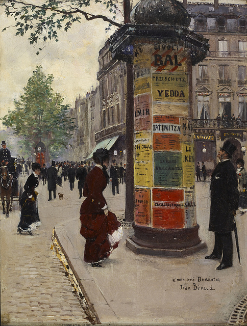
Branding and signage are essential aspects of any successful urban environment. The above painting by Jean Beraud, 1882 shows one of the famous Paris kiosks which not only provided advertising space in a newly urbane and consumer society, but provided a strong Parisian brand: when you see this kiosk, you think “Paris street.” Birmingham has not done a good job branding itself–a pity since there are talented graphic designers here, and places worth branding. Reflecting the fact that the city as a whole has struggled with how to project its own image, we are often disappointed by the lack of good, local public-sphere branding around here.  This past couple weeks have brought a few examples to the fore.

Huh?

First, a couple items that were denied at Design Review Committee last week. The above is a proposed 15 x 20 foot banner (that’s big) to be located on the alley elevation of John’s City Diner on Richard Arrington Blvd. North, advertising the services of City Action Partnership, or CAP. This great organization provides supplemental security and motorist assistance to downtowners–and has certainly been instrumental in making the downtown core one of the safest neighborhoods in the metro. Advantage Marketing presented this design to advertise CAP–but it was sent back to the drawing board for being too incoherent for the average person to understand. The image is confusing; the “Big Wheels” seems to be advertising something else altogether; the font sizes aren’t balanced, etc. CAP does too great a public service; it deserves better design to communicate their mission. And the public deserves something much better to look at.

Begging for identity

Next up in the denial section was the above–a proposed new illuminated sign at the corner pier of Two North Twentieth, the former Bank for Savings Building at the corner of Morris Avenue and 20th St. North. This iconic building from 1962 is the City’s most prominent example of International Style architecture, following in the footsteps of the groundbreaking Lever House on Park Avenue in New York (1952), and a decade of countless copies across the nation (and world). It has never had any signage identifying the building  near ground level (many know it from it’s giant, illuminated advertising marquee on the roof). Not only is the proposed signage uninspired, but it doesn’t even match the building’s logo (itself a tepid, uninspired moniker): “20th” is not spelled out like “Twentieth” which is the actual name. The committee sent this one back to the drawing board too. I hope that a cool, illuminated, and creative solution that works with the rhythm of the concrete panels on the second floor can be devised. This building and this corner need good signage, not haphazard non-design.

Huh? Again

A different kind of mismatch is found at the approach to Railroad Park, where recently banners announcing the Five Points South neighborhood went up. Yes, the Five Points neighborhood stretches all the way north to the railroad tracks. But as a tourist destination and mental construct, Five Points is the area directly around Five Points Circle. It is confusing to say the least, to see these banners when one leaves the new Railroad Park–whose immediate neighborhood has already been envisioned as a distinct entity for redevelopment and marketing purposes (tentatively called Parkside). Showing these banners a dozen blocks away from Five Points Circle is not the right way to go. We should be developing a final name and logo for Parkside (contest, anyone?) and putting those banners up. They can even say in smaller print “part of the greater Five Points Neighborhood” if necessary. Of all areas, this location needs more focused branding, not territorial marking. The money for Five Points banners should be spent on kiosks or other needed items near the Circle itself.

[Sidebar: right across the railroad tracks the Fountain Heights neighborhood extends all the way from the bungalows north of downtown south to the edge of Railroad Park. But does anyone really consider, besides City committees and attorneys, McWane Center to be part of Fountain Heights? Of course not, it’s in central downtown and desperately needs its own sub-neighborhood brand.]

Please, please, I'm desperate for proper branding

Which brings us to our last comment: just like the new neighborhood around Railroad Park that deserves its own brand, other parts of central downtown are long overdue for the same. Other cities large and small–from Portland to Austin to little ol’ Mobile–have branded neighborhoods downtown to great effect: banners and publications use the logos, people say “I’m headed down to —” or “great new lofts are opening in —“. Here all we get is a vague “downtown” or “loft district”–fairly indistinct terms. Just look at what passes for branding in the so-called “loft district” above–signs put up perhaps in the early 1990’s which, in a classic branding nightmare, state “Historic District” with the words “Arts” “Business” and Lofts” interchangeably used on different faces. Which Historic District? Business??? Really? These terms are meaningless. The 2nd Avenue sub-district needs boundaries, a logo, and a name. Downtown should be sectioned off so that lofts east and north of Morris are in NoMo; those west of 20th are in West Central, etc. I am just making up these names–branding experts do this sort of thing much better and all the time. We need to make it happen soon.

Whether neighborhood or building signage, this City needs to demand better branding. It’s one of those things that you take for granted until you see how much sharper it can be in travels to different cities. We have the local talent. There are great examples around of their work. We just need much more. Employ them!

Stay tuned for a post on some of the great public-sphere signage that we do have around here.

[thanks to mbell1975 for the Paris kiosk pic]

24/7 dining

Direct from the big easy

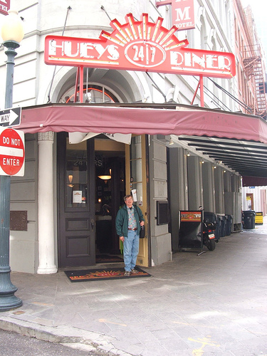
At Design Review Committee this morning, it was revealed that the long-delayed mixed-use project at the block along 7th avenue south between 28th and 29th streets, in the heart of the Lakeview District, is finally proceeding (construction financing is 100% in place and closes in 2 weeks, with work commencing 30 days afterwards). Reduced in size from earlier versions, the current plan is a 4-story building with apartments above, and retail below. A lead tenant has been signed, Huey’s 24/7 Diner, a chain based out of New Orleans that stays open all night, year-round.

That, of course, is great news and perhaps one sign that financing for development projects is finally becoming more available after a drought of several years.

Urbanizing Lakeview

[UPDATE: rendering of the project above, and link to Birmingham News article]

On a sadder note, the small but quaint building at the corner of 28th and 7th designated earlier as the site of a donut shop to complement this project, is now slated for demolition for additional surface parking. The committee objected to this aspect, and sent the designers (Live Design Group) back to revise their plan for this corner. If this neighborhood had a Smart Code in place, which stated up front that corner buildings must remain (or be replaced with other corner buildings, not surface parking), this same issue would not keep repeating itself, again and again.

Late-night burgers, here we come.

[thanks to iisonly for the Huey’s New Orleans pic and Live Design Group for the rendering]

Welcome to the barrio

Renovating for late night tapas

According to Wade Smith’s blog, (he’s the new owner of the former “Storkland” furniture building on the 2200 block of 2nd Avenue North), the guys over at one of our favorite restaurants, Trattoria Centrale, plan to open El Barrio, a latin/taco-inspired restaurant to complement the fantastic Italian fare they’re serving on 20th Street. El Barrio will be open for lunch and dinner with outdoor seating. Stay tuned for more details.

Update: Read more about the project in the News article here.

This is the sort of local, high quality, creative development we’re all excited about. And a great tonic at the end of the week. Salud!