Tag Archives: Design Review Committee

Out with the old, in with the…

Pop go the gas bubbles

This morning at Design Review Committee saw approval for the renovation of the downtown Alagasco building, one of iconic local architect Fritz Woehle‘s few commercial projects (above). The building is also one of Birmingham’s unique examples of Pop Architecture [you can read a good essay on the Pop movement here]. An older building was reconfigured by Woehle–I assume in the late 1960’s–with a smooth stucco skin punctuated by playful, circular windows. These suggest gas bubbles, and present a singular, unique image for the gas company. [Update: I’m now told the building was originally conceived by Woehle for a bank, which makes the circles pure geometric play rather than symbolic of gas bubbles. Although perhaps the allusion drew the gas company to purchase the building?] Urbanistically it has its faults  (a massive drive through at the corner of 20th Street North and Powell Avenue; dark-tinted windows do not engage with the street; there is no real pedestrian scale)—but the Committee paused before approving the renovation.

A measured critique

The main concerns came from committee member Cheryl Morgan (pictured above seated at the left during the presentation), who objected to the vaguely classicizing style of the proposed synthetic stucco detailing (pilasters with capitals, cornices, etc.). While the architect (Alan Tichansky of Williams Blackstock) argued that the new design was more stylistically in keeping with the smaller, attached building which is part of the campus, Morgan felt the smaller historic building would be more respected if the new design were simpler, not so overtly “historicist”, and had closer attention paid to proportions and details. In the end, the committee voted to approve as long as the architect just tweaked the capital details.

In the same vein

While we were not able to obtain renderings for this post, the proposed architecture is vaguely similar to that found right up the street at Adamson Ford (above): big stucco-type cornices, and elements that recall original Birmingham commercial architecture from the 1910’s without replicating the proportional relationships seen in those buildings. A palette of taupes and browns will be the paint scheme.

Many probably have mixed feelings about the Alagasco building; regardless it’s about to be altered beyond recognition, and will go from unusual to conventional. Good? Bad? Indifferent? Discuss.

[thanks to Adamson Ford for the pic of their downtown dealership]

24/7 dining

Direct from the big easy

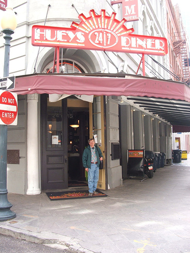
At Design Review Committee this morning, it was revealed that the long-delayed mixed-use project at the block along 7th avenue south between 28th and 29th streets, in the heart of the Lakeview District, is finally proceeding (construction financing is 100% in place and closes in 2 weeks, with work commencing 30 days afterwards). Reduced in size from earlier versions, the current plan is a 4-story building with apartments above, and retail below. A lead tenant has been signed, Huey’s 24/7 Diner, a chain based out of New Orleans that stays open all night, year-round.

That, of course, is great news and perhaps one sign that financing for development projects is finally becoming more available after a drought of several years.

Urbanizing Lakeview

[UPDATE: rendering of the project above, and link to Birmingham News article]

On a sadder note, the small but quaint building at the corner of 28th and 7th designated earlier as the site of a donut shop to complement this project, is now slated for demolition for additional surface parking. The committee objected to this aspect, and sent the designers (Live Design Group) back to revise their plan for this corner. If this neighborhood had a Smart Code in place, which stated up front that corner buildings must remain (or be replaced with other corner buildings, not surface parking), this same issue would not keep repeating itself, again and again.

Late-night burgers, here we come.

[thanks to iisonly for the Huey’s New Orleans pic and Live Design Group for the rendering]

Demolition dilemma

A more sylvan past

The Birmingham neighborhood of East Lake,  once home to a “suburban” pleasure resort and tidy Arts-and-Crafts bungalows, has seen its share of hard knocks in recent decades. Shifting demographics, disappearing business bases, and car culture have all taken their toll. Architecturally, while quite frayed and beleaguered,  downtown East Lake has maintained a fairly consistent streetscape, with most of its storefronts intact, if vacant. Or occupied by marginal businesses. Or even businesses that appear to be anything but marginal, judging by their heavy traffic:

Judge not lest ye be judged

Above is the row of “adult” establishments on the north side of the 7600 block of First Avenue North. The neighborhood, with many typical “inner city” woes, has seen recent bright spots with artists and others moving in to take advantage of the cheaper housing stock. An East Lake Arts District is a relatively new concept promoted to induce more artists to move to the neighborhood.

On the south side of this same block is a continuous wall of historic storefronts. Almost all the buildings are owned by Vince Amaro, of Amaro Development and Construction (no website available). At Design Review Committee today, it was revealed that Mr. Amaro was granted a demolition permit for one of these buildings, to tear it down for replacement by a surface parking lot. Through no fault of Mr. Amaro’s, this permit was granted erroneously, meaning the City is supposed to send an applicant first to Design Review for approval before demolition within an historic or commercial revitalization district. Mr. Amaro started demolition recently; most of the building is now gone except for the four exterior walls.

Another case for a redevelopment authority--and smartcode

Above is the building in question. Mr. Amaro’s intent is to create a parking lot to serve the other buildings, into which he hopes to bring new businesses (he has an appliance store and a gym already slated for an adjacent building, which he is renovating–to a design approved by the normal Design Review process). To those of us who understand the value of the building line, and the anti-urban nature of surface parking lots, it’s sad. What could have helped avoid this situation (besides the obvious improvement in communication between the Planning Department granting demolition permits and Design Review)?

1. If the City had a redevelopment authority in place, these buildings could have been purchased long ago, with the vacant land across the street redeveloped as parking accessed to the rear and new structures at the sidewalk, with incentives offered to developers chosen to implement specific goals;

2. If the City had SmartCode in place, this block could require certain attributes such as building facades brought up to the sidewalk, and could prohibit surface parking visible from the street;

3. Mr. Amaro, barring the above, would be courted by local neighborhood organisations and a compromise could be worked out where the front facade was retained, and the parking was built.

Easy street

Easy street

As it is, with none of the above occurring, Mr. Amaro is left more or less to his own devices. In his opinion–and there is much to sympathize with this–he is investing time, money, and faith into a block that few others want to touch–and that the demolition of one building to provide parking for others he wants to renovate seems reasonable. One wishes him well in his efforts to revitalize the block. One also wishes that there were a better framework in place to prevent the ad hoc nature of this demolition permit.

Most of all, one wishes there were a really good strategic plan for this block that could be implemented by a redevelopment authority, or at least SmartCode that would let developers know what to expect up front.

This author personally tried to convince Mr. Amaro this morning to at least consider saving the facade, I’m afraid to no avail. He plans to continue demolition and complete the process by week’s end.

Finally 4 stars

230 count cotton is coming

Today the Design Review Committee gave the go ahead for foundation work to start for the new downtown Westin at the BJCC. Courtesy of Joseph Rabun of Rabun, Rasche, Rector, Reece Architects, we show you the design of the hotel exterior (note: these renderings will continue to change as the design develops).

Do we spy Chris Hastings to the right?

The exterior is planned as a mix of brick and Centria metal panels, a high quality architectural panel system. Above you see the planned covered terrace and seating for the “signature restaurant” to the right of the image–Chris Hastings of Hot and Hot Fish Club has announced he’s negotiating to run it.

Storefront-ish

As noted in this blog previously, the design has been revised so that not just the restaurant, but conference areas to the other end of the hotel open onto the street. Above you see the “storefront” articulation in the wing which houses the swimming pool on the roof. I’d prefer real stores to conference rooms/corridor space, but at least the scale of the wing is human.

Almost vegas

Last but not least, the second floor pool, surrounded by terraces, health club, and cabana bar. OK, it’s not exactly the Tower Suites pool at the Wynn Las Vegas, but it looks nicer than most other downtown hotel pools I can think of in town.

More on this project and the surrounding entertainment district as we get more info.

[by clicking on the images you can enlarge them]

[Thanks to Rabun Rasche for the renderings]

Design time

Good graphics shape public perception

First, great news from City Hall: the same City team that has been rolling out the visually impressive Civil Rights Heritage Trail markers above (designer: Ford Wiles of Big Communications) is working on a complete wayfinding project for the City. As we’ve stressed in numerous posts, it’s long past time for a city our size to have a comprehensive plan for visual navigation through the urban environment. If the Civil Rights markers are any indication, we can expect high quality, thoughtful graphics and other environmental cues that will make our City more user-friendly for resident and tourist alike. We’re excited about this news, and look forward to a roll-out in 2012. We’ll report more when we have more details.

Second, not so great news from the  Design Review Committee: the Webb Building, whose initial renovation proposal we praised here, before the owner switched course and did something completely different which we lamented here. Before the holidays, the owner engaged a new architect, Herrington Architects, to present a “compromise” solution, which the DRC approved (below).

Disappointingly off-base

The above rendering shows the unevenly scored stucco (which had angered the Committee previously, and which was such a departure from the originally approved sleek metal banding) now being presented with contrasting paint colors, creating a “panel” effect. It is surprising that this blank/solid feel of this stucco portion, which continues to make the building top-heavy, was approved. There is an unfortunate parallel with these new panels and the ubiquitous applied panel schemes of the 1960’s, which were used to cover up historic facades across this downtown and others. Most likely, the new architect was given very little leeway to be creative, perhaps even constrained by the owner. The Committee itself does not have the power to force someone to return to the previously approved design; in this case, I sure wish they did.

Tasty

Finally, a new business is planned for downtown as part of a renovation of an historic building. Look for details in the next few days in the Birmingham News. The pic above is a small teaser, hopefully whetting your appetite for more info.

[thanks to vizual2 for the Civil Rights Trail pic,  Herrington Architects for the Webb Building rendering, and wendy_tsang for the yogurt pic]

Sizing it up

What can we learn about Birmingham and its urban core after comparing it to Mobile’s, the third-largest city in the state (but second biggest metro, at about half the size of our 1.2 million)? On a recent trip I was able to get a quick glimpse of downtown Mobile, and observe some interesting things.

Pointing in the right direction

First, wayfinding. Central Birmingham has basically none–and we need it. Bad. For anyone visiting (whether from afar or just the ‘burbs), graphically clear signage which helps you navigate a city is essential. The above is an example of signage found throughout downtown Mobile–simple, to the point, and informative.

Good signage is good place-making

Second, good urban signage. Birmingham–thanks in part to enlightened members of the Design Review Committee, is more likely today to approve well-designed, projecting and/or illuminated signage for businesses in our urban areas. But the process can still feel like a struggle (one sign we designed for a project downtown took over 3 months to work its way through the City Legal Department after DRC approval). To the left you see some excellent signage at the hip Dauphin Street Taqueria ; in downtown Mobile, the city has a financial incentive to encourage owners to upgrade signage and illuminate it. Fantastic incentive, and the nice projecting signs across the core are a testimony to its success.

Third, Mobile’s older street grid means narrower dimensions–so instead of our wide avenues with 5 or 6 traffic, turn, and parking lanes–you get 4, or 3 total lanes which makes for a more pedestrian friendly environment (quicker to cross, and less traffic on the streets). Below is a shot looking towards the Battle House Hotel, Mobile’s smaller version of our old Tutwiler Hotel, demolished in the 1970s for the First Alabama Bank Building. In Mobile–where development pressure downtown was so slight, it makes Birmingham look like an Atlanta–the hotel was just quietly boarded up and remained vacant until the Retirement Systems of Alabama incorporated it into its huge RSA Tower complex completed a few years ago. Because of the RSA’s muscle, downtown Mobile now has 2 4-star Renaissance hotel properties–while Birmingham has no 4 -star properties anywhere close to downtown (though a Westin is planned to break ground shortly).

Narrow streets, restored hotel

Fourth–of interest to those saddened by the demolition of the old Birmingham News building for the creation of….a surface parking lot: in Mobile the local Press-Register donated their old facility to a non-profit called Center for the Living Arts which promotes the arts throughout downtown Mobile. An 8000 SF center for contemporary art is part of the new reuse of this building, seen below:

A better use than surface parking

Yes, we’re thrilled the News built a new facility downtown. It’s just a shame that instead of visualizing a new use for an outdated building like they did in Mobile, they tore it down for a few parking spaces instead. A very, very 1969 solution to a problem.

Which brings us to the train station. In 1969 we tore ours down. Mobile’s still stands, although mostly vacant (they lost their passenger service long ago), and at a disadvantaged location down Water Street (it was a hardy 20-minute walk down a warehouse and gas-station-laden 6-lane highway from the Battle House). If Water Street could be re-envisioned as a pedestrian-friendly boulevard, with mixed-use and a waterfront promenade–then the old station could be a wonderful terminus again.

Any takers?

Mobile’s core is much smaller than Birmingham’s by any measure–fewer office workers, fewer residents, fewer buildings–and the scale is very different. It feels more like a small city than, well, a medium-sized one. This smaller scale is one factor that can make redevelopment easier. Lower Dauphin Street is lined with bars and restaurants and even some retail shops–but all the buildings are mainly one or two stories. Big, complicated, and expensive redevelopments are not necessary on this scale.

However, some basics of adaptive reuse, signage, even public postings of imminent Design Review hearings are all instructive as we work to create a better Birmingham. It’s clear that Mobile has made some real efforts to reinvigorate their center. And, the City is considering adopting SmartCode for their downtown, similar to Montgomery, to help propel development in the right direction. This is something we’d love to see here too.

When in Mobile...

On a last note, I couldn’t help notice that city parking meters downtown allow 15 minutes per quarter–rather than the 60 minutes per quarter in Birmingham. And we have a much, much more congested downtown than Mobile. I believe Birmingham ranks as one of the largest cities with the cheapest on-street parking. This puts more cars on the street, circling for those cheap spaces–rather than considering decks, or walking, or transit. We’ve got to get used to paying more at the meter here.

Next post–Austin, TX! Happy New Year everybody. Here’s to a great 2011 in the ‘ham.

The fraying fabric of Five Points (2)

Really?

In the second article about the critical period Five Points South is going through right now, the above image should give everyone pause. It seems not too long ago, this little strip mall on the 1900 block of 11th Avenue South was home to a longtime hairdresser, hot dog stand, and convenience store, as well as an H and R Block. The convenience store remains, but the hot dog stand is closed and cardboard boxes and rear ends of display cases block the plate glass. A vacant storefront has a “This is not parking for restaurants” sign menacingly scrawled, amidst other cheaply done, temporary signage. In fact, the cacophony of old and new signage, “temporary” banners and posters, and the overall complete lack of street presence makes this surely one of the most shameful urban presentations in Five Points.

Worst of all is the new “Bail Bonds” sign, in horrific black and white, with an incredible graphic pasted across the storefront stating “Arrested? Bond, James Bond, Inc. ALWAYS OPEN”. Is this for real? Did it really get approved by Design Review? Here’s a detail of this storefront below:

...and again, really?

If ever there was an example of the need for a redevelopment authority, which years ago could have acquired this property and solicited for redevelopment more appropriate for the neighborhood, this is it. As it is, the property and its tenants have really sunk to a new low, and it’s depressing. I mean, Bail Bonds? In the middle of Five Points? Not exactly the image we’d like to convey in the metro’s center for dining and nightlife.

On a more positive note, the local merchants (and there are many wonderful merchants who keep us optimistic about the place) have formed a committee to address “immediate tasks and long term goals” for the area. There’s a piece in the Birmingham Business Journal on this announcement here.

And on another positive note, unrelated to Five Points but a few blocks south–a friend alerted me to the fact that Tom Leader, the Berkeley, CA-based landscape architect responsible for the design of Railroad Park, now features that park on the front page of his website. Here’s one of the aerial pics you can find on his project page, showing the elegantly layered design of the park from above:

let's densify the edge and connect it with bike paths!

So far the main complaint I have about the park is the lack of sidewalks bordering it on 1st Avenue South (hopefully they are coming soon!?!). Oh, and one more complaint–that greenways/bike lanes aren’t already in place making it easy to reach this incredible space from across the city by bike. Regardless, I’ve been there almost every day or night enjoying it (walking or biking from home), and it looks like the rest of the City is too. That gives me hope after a grim meet-up with “James Bond” up the street.

[Thanks to Tom Leader Studio for the aerial pic]

Ask and ye shan’t receive

Design Review Alert: The Webb building, on 20th Street North and Second Avenue, has undergone a renovation definitely not in keeping with the design approved by the Design Review Committee back in March (see our initial post, with the approved renderings, here).

Going rogue

Instead of the sleek, metal fascia coursing (with the ability to host signage) proposed by architect Pete Pritchard in March, that was unanimously approved by the DRC, we get scored stucco panels that…don’t seem to be approved by anyone. Unless I’m missing something here, this is an example of a building owner going through the correct motions of hiring a good architect, preparing renderings, going to DRC, and getting approved—and then doing something completely different. Why? And what repercussions are there? This is such an important intersection, and to replace solid, blank infill panels with, well, solid, scored infill panels is not acceptable. What was originally storefront glass transoms needs to be replaced either with glass, or with projecting metal/signage, in order for the building base to be correctly proportioned to the top.

Next door, moreover, the owner also owns another great historic building. Guess what he started doing today? See below:

Are you kidding me?

Yep–they’re painting all that beautiful cornice, trim, and historic brick what appears to be battleship gray, in a manner similar to what we saw in the 1970s when downtown property owners were desperate to try to camouflage all that old-fashioned detail in order to compete with suburban malls. This paint job, unless I’m wrong, did not go to Design Review and is literally going up on the whim of the owner.

[It is my understanding that architect Pete Pritchard has not been engaged in either of these situations.]

I’ve learned today that DRC will review what’s happening at both properties and ask the owner to come into the next meeting to explain himself. Penalties? Not sure, but one obvious one is denial of certificate of occupancy. Let’s hope we’re not left with a recalcitrant owner, a partially painted and heavily stuccoed pair of forlorn buildings,  and a frustrated City in a reluctant standoff mode. Stay tuned.

[thanks to Chuck Strahan for the pics]

Dead customers can’t buy a lot of chicken

At yesterday’s working session of a subcommittee of the Design Review Committee, Chick-Fil-A came back once again with a revised proposal for the heavily trafficked NE corner of Highland Avenue and 20th Street South in the heart of Historic Five Points South.

A move in the right direction, but not enough

A summary of the session can be found in the News here, or over at Second Front here. Suffice it to say that while the site layout–and the drive-through’s impact on the layout–is still a serious concern of the subcommittee, the design of the building itself has undergone a sea-change from earlier versions. Local firm Cohen Carnaggio Reynolds has been hired by Chick-Fil-A to try to win over hearts and minds. What exactly is at issue with the design of the building?

The quick sketch above roughly illustrates the difference between earlier schemes–which showed a typically suburban “outparcel” site strategy (#1 above)–and the current scheme presented yesterday (#2 below). Whereas before the building mass was dwarfed by the relative sea of surrounding asphalt parking (and drive-through), now the building has been elongated to take up over 80% of the street frontage on both streets. The parking and drive-through are now fairly well hidden from either street. (Please note these sketches are not to scale.)

From an urban standpoint, this is a good thing. Urban neighborhoods depend on density for their success as dynamic environments. It’s pretty intuitive: how many of us have visited a dense environment like Manhattan and walked a mile without noticing? Whereas in a less dense environment, like most of Birmingham, most of us really notice–and avoid it–if we have to walk more than 1/2 block to a destination. When we don’t have a dense, vibrant, interesting wall of buildings fronting the street to hold our interest and make us feel secure, we don’t want to keep walking. Brightly lit storefronts keep us walking; big parking lots don’t.

How did the architects stretch out this new, 291 feet of facade? While actual floor plans were not presented, it appears that a lot more seating was added–both interior and exterior, some under a covered pergola. And how did they respond to the Appeals Board’s decision to deny Chick-Fil-A in part because the building previously presented was clearly purpose-built for Chick-Fil-A, rather than as an adaptable commercial structure more typical to the area?

The response was to offer several possible versions of how the building could look. In each one, the building was imagined as a simulation of organic growth over time, dividing up one facade into 3 parts, with each part resembling a somewhat different building. While this sounds reasonable in concept, it is very hard to pull off, especially if the same architect is designing the entire project. Simulating architectural diversity that normally occurs organically, and over time, often results in a “Disney Effect”, where the street ends up looking like a stage set.

A simulacrum of the real thing

Take the outdoor street and commercial “facades” at Brookwood Mall, pictured above. While the design has certainly improved the mall from a planning standpoint–opening shops onto an outdoor sidewalk, facing new restaurants, with parallel parking and street trees mimicking an actual urban street–the architecture itself is disappointing. Because despite the effort to modulate the elevations, with different heights, setbacks, and architectural “styles”, the whole thing still looks like it’s one big mega-project that came from the same hand. Why? The level of detail is consistent; while from facade to facade the brick may differ from the stucco, and the impressed tiles differ from the cornice, overall there is a similarity in both material and design quality that makes the experience more homogeneous than diverse. If the developer had one master plan, and hired multiple architects to create the facades using certain guidelines, then the results would have had much more potential. Of course large-scale commercial development rarely goes that way.

Rather than simulate 3 buildings, I think it would be more fruitful to consider one consistent building, and vary the scale along the facade to achieve a certain diversity and rhythm.

A post-modern infill down the street

Interestingly, the Committee towards the end (with Cheryl Morgan leading the discussion) urged the architect to not depend on historic precedent to such an extent that the buildings look like imitations of Spanish Revival or Art Deco, two common styles of the Five Points area. “Contextual” and “Compatible” do not mean “Imitation”; Morgan pushed for a “21st century solution” that, while clearly new and  of this time, responds in a respectful way to the scale, rhythm, and massing of the eclectic neighboring buildings. Too often when new buildings are designed to be “Tudor” or “Spanish Revival”, modern budgets and available craftsmen make the details very disappointing compared to the models of 100 years ago. Above you see an example at Pickwick Place a couple blocks north of the proposed site, where an infill project in the early 1980’s gave us stucco facades with end piers and grooved details meant to evoke the 1930’s Art Deco of the Pickwick Hotel to the south–but while the massing feels right, the paucity of detail, the banal storefronts, and the cheap looking light standards, clumsy railings,  and ugly metal coping all say “1980’s on a budget.”
21st century contextual

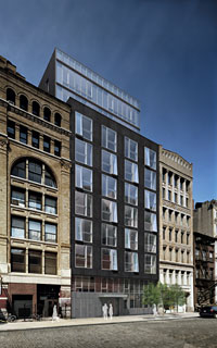
This residential project at 48 Bond Street (designed by Deborah Burke) in New York is an example of a confidently modern infill structure that manages to respect and respond to its neighbors without imitating them. It matches the parapet heights of its neighbors, recessing its additional stories back from the street line; it uses proportion and material to relate without copying. And frankly, even with New York budgets, copying historic elements is almost bound to disappoint once you start designing details. And details can make or break a project–as Committee member Mark Fugnitto stated, the details will determine whether the proposal is a good or bad building. And, as this is still a work in progress, we  don’t have the details yet.

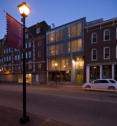
Another example of sensitive modern infill architecture that doesn’t try to imitate the past is the Portland Harbor Hotel annex below in Portland, ME. Designed by Archetype, this project proves you don’t have to build a corporate template, or imitate the past, or simulate diversity, in order to create something both substantial and adaptable to other uses in the future.
Elegant and substantial

Now, what still remains–and what the architect can’t fix no matter how hard she tries–is that Chick-Fil-A is still hell-bent on a drive-through, on a single-use for the entire site, and of course on their no-Sundays policy. I think all 3 of these represent big flaws to the development of the site.

First, a drive-through is incompatible in this neighborhood.  Chick-Fil-A’s traffic engineer stumbled a bit yesterday when he finally acknowledged that the famous “47 second” average drive-through wait–“the best in the business”– was actually 47 seconds from placement of order to receiving that order. You can wait much longer to get to the box and ramble through the order itself. So at peak times, it is all too easy to imagine the stack of cars spilling out into the parking area and creating traffic hell all around the site, which is already hellish enough. Couple this with the fact that people are not getting out of their cars like everyone else in the neighborhood and walking to their destination makes me–and most of the committee–still skeptical that the drive-through can be proven compatible with the neighborhood. [A friend of mine just timed his drive through experience today at the Eastwood Village CFA location and clocked 374 seconds total from entry to exit–and this was a good 20 minutes before CFA’s stated “peak time” of 12:15 to 12:45.]

Second, while it’s admirable that the company is now willing to reduce total number of parking spaces, and simulate multiple storefronts across a wider street frontage, this is no substitute for true urban diversity, with multiple businesses located adjacent to each other. This prominent site is much better suited for mixed-use than for single-use, and while CFA admits they have “more property than they need”, they refuse to entertain the idea of subleasing out a portion to another business. Hardly surprising, but still disappointing (and disappointingly beyond the purview of the Design Review Committee).

Finally, while somewhat unspoken (and again beyond the DRC purview), it is truly a shame that, because of CFA’s policy of not opening Sundays, this important intersection in one of the most popular urban destinations for locals and tourists alike would be completely dead for a full half of every weekend. Not the schedule you want in one of the few dense, around-the-clock neighborhoods we have in this city [Pancake House: you need to open for dinner!]. And speaking of the Sunday closing: CFA is known for hiring only clean-cut workers with proven “family values”; its corporate office financially supports such groups as Focus on the Family, a controversial organization that campaigns against gay rights among other things. The fact that the Five Points neighborhood is one of the most demographically diverse and accepting in the entire state at the very least lends an irony to CFA’s desperation to be there.

When the traffic engineer was grilled on vehicle counts and flows, one objection was conflict with pedestrians at various points around the site. His reply was that of course CFA wants to avoid pedestrian accidents: “Dead customers can’t buy a lot of chicken.” Oddly enough, that quote seems like a good way to sum up this entire effort thus far. Stay tuned.

[thanks to KMGough for the Portland infill; Deborah Berke for 48 Bond Street]

Design Review Alert

The Design Review Sub-Committee will hold another “working session” with representatives of Chick-Fil-A to “review Chick-Fil-A’s latest design proposals” for a new restaurant on the corner of Highland Avenue and 20th Street South in the heart of the Five Points South Historic Neighborhood.

The meeting will be Tuesday, July 20, 2010, at 4 PM in the 5th floor conference room at City Hall, and is open to the public. However, unless requested by the Sub-Committee, no public comments will be taken, and seating is limited in this conference room. For those who cannot attend, I will do my best to report the proceedings.

No rulings are made at the working session.