Tag Archives: signs

Design review alert

A sad end is in the works

We have learned that the owners of the building that for many years (1945-2004) housed The Social Grill, plan to sell to downtown landowner Bobby Crook, who in turn plans to tear the building down for surface parking.

The historic building (distressed after years of deferred maintenance and showing the remains of 1960’s-era metal insert panels at the storefronts) holds the SE corner of Third Avenue North and 23rd Street, and is notable for its large projecting sign. While in an official Historic District downtown, and subject to Design Review Committee approval, unfortunately the Committee is limited in its ability to prevent owners from tearing down buildings for surface parking. Once again, Form Based Code would be helpful in setting guidelines that, for instance, would state that corner buildings in particular districts must remain; and conversely corner parking lots should be turned back into buildings.

As of yet, there is not a date set for when this proposal goes before Design Review.

Waffle House across from...the Pancake House?

We do know that this Wednesday morning one of the Design Review items will be a new Waffle House in the Studio Arts building (pictured above right) which faces the circle at Five Points South. The Original Pancake House has occupied the opposite building (pictured above left) for many years and is a local institution for breakfast (although it’s part of a national chain). Waffle House, evicted from its current location just west of the UAB campus to make way for university development, already plans a new storefront location a few blocks west of Five Points in the heart of the university medical district (recently approved at Design Review). Despite the roughly similar menus, Pancake House is only open for breakfast/brunch daily, while Waffle House is a 24-hour, 365-day/year diner.

Finally, on Wednesday the  wonderful guys (from Trattoria Centrale) opening El Barrio in the 2200 block of 2nd Avenue North will reapply to the Committee for approval of a tasteful projecting sign [see our previous post here]. Our verdict: the Committee needs to approve this sign!!!

[thanks to bhydro for the Five Points pic]

Details, details

A lot of our time recently has been spent on big issues: form based code, new urbanism, corporate footprints within historic neighborhoods, major public greenspace. It can be equally useful to examine the myriad small details that go into our built environment–the ones that are often taken for granted.

Today’s Design Review Committee meeting was a good place to reflect on these small things (and the hard work–often thankless–that this volunteer committee puts into all considerations, large and small).

Signs of the (changing) times

The Wachovia Tower (formerly the SouthTrust Tower, shown above right a few years ago before that merger with Wachovia) is now the Wells Fargo Tower. Executives from Wells Fargo presented a proposal to replace the current abstract Wachovia logo (approximately the same size as the old SouthTrust “S”) with a much larger “Wells Fargo Bank” that stretches across the blank, dark spandrel glass of the penthouse, repeated on each of the four sides. Noting the importance of the chamfered penthouse corners, the Committee asked for just a few feet of breathing room to either side, slightly reducing the size of the sign. After the WF people initially objected–claiming the sign as presented was the perfect size to be seen “from all the major interstates”–they bowed to the reasonable assertion that the sign should be proportionally correct to the building and pleasing to the eye for pedestrians, not just stressed-out commuters on the freeways. Who, as Committee member Cheryl Morgan pointed out, should really be “concentrating on driving” rather than gazing at distant signage.

Illuminated signs (and this one will be lit with expensive, but energy-saving LEDs) are important symbolic markers on a skyline. I’m happy this building–whose branding has long suffered with tiny, illegible logos, is now getting a well-proportioned, clear sign that lives up to the importance of the southeastern headquarters for a major national bank. And I’m happy the Committee insisted on a very small, but important adjustment–improving the view of this sign from the surrounding streets and windows in the CBD.
Clever retro aesthetic

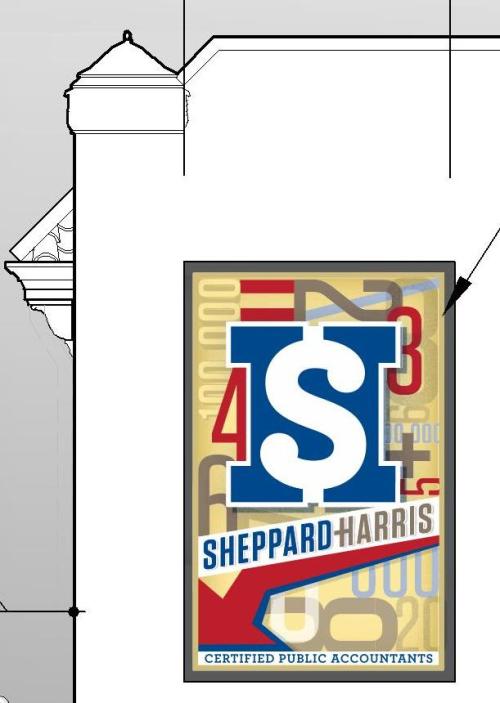
There were also two other, similar cases, both again involving signage. One, for Sheppard-Harris and Associates in Fire Station No. 4 in the 200 block of 24th Street North (my firm designed the exterior renovation), won approval for both a new projecting (blade) sign which will illuminate at night, and a new, painted mural sign at the blank side of the building facing a parking lot along Third Avenue North (shown at left).  Dog Days of Birmingham, in the 100 block of 18th Street North in the old Hunter Furniture building  (which was discussed earlier here), won approval for a new blade sign but was denied approval for a painted sign on its side wall facing First Avenue. Their proposed painted signage did not show much artistic creativity (in contrast to the Fire House sign, designed by The Modern Brand), which in part led the Committee to judge it banal and redundant given the prominence of the large blade sign around the corner. I’m a big fan of signage downtown–a full post to come on that soon–so I hope that we can see a new proposal for a more thoughtfully designed painted sign at this location.

Some other items:

1. A crude picket fence (in lieu of a proper railing) constructed without a permit at a porch of an historic Highland Park house that the Committee agreed should be replaced with something more appropriate to the house;

2. A new landscape plan for a small parking lot directly east of the new Marriott Residence Inn in Five Points South whose landscaping and paving plan was passed–but whose many, excessive “No Parking–Tow Zone”-type signs strewn across the site were denied;

3. New wood replacement windows in the Blach’s Building annex in the 300 block of 20th Street North (to accommodate new loft apartments planned for that building) that the Committee easily approved;

4. A renovation plan for the new Naked Art gallery in Forest Park commerical center, unanimously approved;

5. And a somewhat ingenious steel-framed parking deck slotted behind 11th Avenue South to service the newly renovated Terrace Court Apartments (and the general public) in Five Points South, designed by Cohen Carnaggio Reynolds–also unanimously approved.

All of these small-ish items aren’t big-ticket controversies or complex designs. But added up, these small bits (along with the larger and/or more prominent projects) help make our city’s environment special. One more pat on the back to the Design Review Committee for slogging through every item, however small, with an eye towards helping improve Birmingham’s built environment.

No parking deck required back in the day

[Full disclosure–the vote for my signage package was not unanimous: Chairman Sam Frazier cast the lone vote against, objecting to the blade sign illuminating at night. While perhaps unusual for a CPA to have illuminated signage, I felt it important in the burgeoning, (almost) 24-hour 2nd Avenue neighborhood for the company to have a night-time presence.]

[thanks to hannerola for the SouthTrust pic and Dystopos for the historic Terrace Court pic]

Going Rogue (1)

Today’s light-hearted (yet purposeful) post is the first of many to address one of my pet peeves across the city: flagrant disrespect of the City’s Design Review process for renovation of facades (in historic or commercial revitalization districts). Downtown, Five Points, Lakeview, and other popular neighborhoods fall under the jurisdiction of the Design Review Committee, which rules on paint colors, storefront configurations, and signage proposed for buildings within the districts. Now, this is an imperfect, sometimes subjective process–but for the most part the committee strives to ensure that the building’s skin (see previous post) is up to a certain standard.

Really??

Here, at the Magic City Grill (which by the way serves a fairly tasty meat-and-three for lunch and a decent Sunday breakfast), you see the transoms covered over with solid painted panels. Not good to start with. But the paint job looks like somebody was either drunk, or paid very little–drips and blank splotches all over the place. But worst of all–the former sign box over the second bay is just painted out–and there is no main sign announcing the business on Richard Arrington (there is a fairly ugly one around the corner on 3rd Avenue). Instead, besides a sign over the fourth bay announcing “Magic City Grill Ice Cream and Sandwich Shop”–confusing since the main restaurant really serves neither–there are two cheap “Pepsi” signs tacked above the storefront. Another very prominent corner, and the place looks like a real afterthought. Good signage and good paint jobs make people want to stop in.  This has neither. And those Pepsi signs–well, they don’t belong on an historic building, period. Maybe if they were expertly painted on the alley side(to the right in the photo you can see an expertly painted sign, old school-style: House of Dixie Uniforms).

I don’t think Design Review would have possibly approved this facade “renovation.” If I’m wrong, someone let me know. And the cook in the kitchen didn’t necessarily have anything to do with the exterior improvements or lack thereof: this little post is NOT a commentary on the worthiness of the cuisine.

Woof!

Sometimes recessions bring out interesting entrepreneurial efforts (see architects selling ice-cream in my post below).  Sue and Jimmy Johnson have purchased the former Hunter Furniture building on 18th Street North and plan to open a “doggie day care” facility, the first of its kind downtown. The owners intend to create a loft upstairs for their residence. While primarily known recently for its electric turquoise coloring, this building has a special place in local urban history: when almost the entire block was razed for a promised but never-to-materialize development, Hunter Furniture refused to bend to pressure. Today it stands alone amidst a sea of surface parking, a (rare) testament to grassroots resilience to the destruction of urban fabric.

People who live downtown tend to have dogs; walking dogs in the mornings and evenings helps foster community, creates pedestrian (and canine) foot traffic, and makes streets feel safer. While most residents are happy to finally have a dog park at George Ward Park, as yet there is no dog park downtown to which people can walk their furry friends. I’m hoping that the local Bark for a Park group will find a great place soon to start downtown’s first dog park. It doesn’t have to be big. And there are plenty of physical places where, in theory, you could locate one. Take a look at the Deep Ellum Dog Park in downtown Dallas for an example of what we could do here.

I also hope the Johnsons will figure out a way to preserve the old Hunter neon sign on the building; in my opinion signs like this should be landmarked and a special fund set up to help owners preserve them (the cost of restoration and operation can be daunting). A future post will discuss the importance of projecting signs and graphic imagery in dense, urban areas. But I could not resist posting this wonderful shot of Hunter Furniture and 18th Street from the mid-1970’s, before the wholesale demolition all around it.

Here you see the old WBRC-TV studio next door, the old Pasquale’s pizza downtown location, and a series of other businesses marching up 18th Street. Almost all these businesses are now defunct or demolished; Hunter wasjust about the lone survivor from this era (it finally closed in November, 2009).

It’s a shame that after all these years, the parking lots surrounding Hunter are still…parking lots. If this site could be redeveloped with new businesses, living units, restaurants, a shared parking deck, and maybe a small (dog-friendly) park, I’m convinced that fantastic older buildings nearby would see renewed interest in redevelopment (i.e. the Thomas Jefferson Hotel).

And the Johnsons could get some more 4-legged customers.

(pics courtesy army.arch, top; JCMcdavid, bottom)