Category Archives: Uncategorized

Suburban = Urban?

could it get worse?

Ah, the demise of the infamous Ruby Tuesday restaurant in the heart of Five Points South. Infamous because a banal, cookie-cutter shopping-mall out-parcel building was plopped down 16 years ago on one of the most historic and important corners in this city–where 20th Street meets Highland Avenue South. There had been a plan in the early 1990s to redevelop this lot (originally a fine mansion) as a 14 story, mixed-use building called Renaissance Plaza. Instead we got a cheap looking, generic box sitting on a parking lot.

Well, lo and behold, the restaurant has closed after 16 years. And last week’s Design Review Committee approved a new development with nary a comment or dissent. Is it a dense, mixed-use development bringing interesting new retail and restaurant tenants? Is it thoughtful, urban architecture suitable to this distinctive corner surrounded by the Shepherd-Sloss Building, Terrace Court Apartments? Unfortunately it is neither. It is a stand-alone Chick-Fil-A restaurant, complete with drive-through and surface parking. This plan sketched here is very approximate, but gets the idea across.

presenting for Chick-Fil-A

I don’t want to say Chick-Fil-A shouldn’t be in Five Points– but can we talk context?  Gorgeous terra cotta detailing and the first high-rise apartments in the South across the street.  Crumbling, perhaps, but at least special.

unique across the street

These older buildings speak of a particular place and style — “I am in Birmingham”, not at any newish strip mall.  The unique architectural fabric of this city is what make visitors say: what a beautiful town you have. Hard to say that about  most strip malls/outparcels since they all look alike. But I digress; this is not a commentary on the architectural integrity of the American strip mall. That’s another post.

But Five Points! An area that is a food mecca for the metro area…  I am not against fast food in the least — or a good Chick-Fil-A.  But where is the comprehensive plan for revitalizing this area? Let me dust off some shelves somewhere, because this can’t be part of it.  Why? Kudos on the outdoor seating — but that’s about all I can say positive about the current plan. Take a look at Portland.  As we’ve discussed before, urban areas succeed with density.  In Portland you see sidewalks lined with shops and restaurants, including a McDonald’s storefront. No drive-throughs. And 90% of the property is not a vast dead zone of car park and drive-through lanes.

fast-food, urban-style in Portland

One reason why this sort of totally inappropriate development still happens here? We have no Redevelopment Authority. A RA is an independent, public agency that can buy and sell property, solicit proposals from developers, and finance buildings and development. They can take a good plan and actually implement it. This site would be a prime example of the kind of place identified by a RA as important to a city and the urban environment. It deserves to be built out according to a good plan. Not just randomly selected by Chick-Fil-A. And their drive-through mentality.

Drive-throughs, while ubiquitous to the American landscape, are not appropriate in dense urban areas. They require additional curb cuts which make pedestrian sidewalk use hazardous; they are horrible for the environment (all those motors idling); they discourage people from getting out of their car and enjoying a walkable streetscape; and the land use is wasteful (lots of asphalt). Various cities have started banning new, urban drive-throughs for all of these reasons.

I want a thriving Five Points.  I want the opposite of a strip mall — non-chain boutiques, restaurants that use local produce, new loft mid-rises — a snobby, creative-class dream?  OK then. I will also take some chains and fast-food that may be necessary  — but with the caveat that they should fit in with a comprehensive, urban vision for this area. I want more more more. I know, I want too much.  But I can dream, right? (thanks to dystopos for the Ruby Tuesday pic; Birmingham Public Library for the 1972 pic of the Shepherd-Sloss building, and alexabboud for the pic in Portland.)

Ask and ye shall receive…

A healthier skin

As promised, the Design Review Committee met this morning, 7:30 AM sharp. Yours truly was first on the agenda, and good news–we passed with flying colors. But, as earlier hinted, more good news…Pete Pritchard presented his design for renovating the facade of the Webb Building. The section between the storefront and the second story will be replaced with a stucco surface to match the upper floors, and then wrapped with an aluminum horizontal band whose simple, flowing lines recall the art deco style above. The storefront, which has been painted over in parts, will be cleaned and repaired.

And then the first step will be completed. Let’s hope that a new tenant that would really activate that corner will be tempted by the fresh facade. Thanks Pete!

A new beginning for the Webb Building

Skin-deep Beauty (2)

Update on the Webb Building: I opened up the agenda for Wednesday’s Design Review Committee meeting (see previous post)–I’m presenting the design for renovating a small historic structure on 24th Street. Next up on the agenda I noticed my friend Pete Pritchard is presenting a design for renovating—the Webb Building! (see the post Skin-deep Beauty from last week) It sounds like a modest renovation, but we’re delighted to hear it. We’ll see Wednesday what Pete’s come up with, but until then I’ll leave you with a pic of Nooch, another cool restaurant designed by Karim Rashid (this time in Chelsea in NYC)–aglow on a city corner. Tasty food, by the way. Pic courtesy 24gotham.

Illuminating an urban intersection

Going Rogue (1)

Today’s light-hearted (yet purposeful) post is the first of many to address one of my pet peeves across the city: flagrant disrespect of the City’s Design Review process for renovation of facades (in historic or commercial revitalization districts). Downtown, Five Points, Lakeview, and other popular neighborhoods fall under the jurisdiction of the Design Review Committee, which rules on paint colors, storefront configurations, and signage proposed for buildings within the districts. Now, this is an imperfect, sometimes subjective process–but for the most part the committee strives to ensure that the building’s skin (see previous post) is up to a certain standard.

Really??

Here, at the Magic City Grill (which by the way serves a fairly tasty meat-and-three for lunch and a decent Sunday breakfast), you see the transoms covered over with solid painted panels. Not good to start with. But the paint job looks like somebody was either drunk, or paid very little–drips and blank splotches all over the place. But worst of all–the former sign box over the second bay is just painted out–and there is no main sign announcing the business on Richard Arrington (there is a fairly ugly one around the corner on 3rd Avenue). Instead, besides a sign over the fourth bay announcing “Magic City Grill Ice Cream and Sandwich Shop”–confusing since the main restaurant really serves neither–there are two cheap “Pepsi” signs tacked above the storefront. Another very prominent corner, and the place looks like a real afterthought. Good signage and good paint jobs make people want to stop in.  This has neither. And those Pepsi signs–well, they don’t belong on an historic building, period. Maybe if they were expertly painted on the alley side(to the right in the photo you can see an expertly painted sign, old school-style: House of Dixie Uniforms).

I don’t think Design Review would have possibly approved this facade “renovation.” If I’m wrong, someone let me know. And the cook in the kitchen didn’t necessarily have anything to do with the exterior improvements or lack thereof: this little post is NOT a commentary on the worthiness of the cuisine.

Skin-deep Beauty

The good, the bad and the ugly

Last night at dinner, my friend K was ranting that she wished we could tear down all of downtown’s “bombed out” buildings…a heated argument ensued, but I get the gist.  The empty old buildings weigh more on your eyes than the renovated ones, the new ones.  So if we filled all these empty buildings with ground floor activities, that would go a long way to fixing her (and others’) perceptions — if all the buildings were fixed up, but still empty — that would look good, but not get to the goal.

A building in an urban setting serves multiple purposes: it shelters its inhabitants; it welcomes visitors; it facilitates commerce; and it defines the public space outside. It is this last item which concerns a building’s skin: where the surface of a building meets public space. You could argue that a building with an ugly skin could still have a positive effect on public space if this skin is permeable enough–both physically and visually–to encourage lots of human activity at the street (like this rather grim building above in Manchester, UK that nonetheless has continuous retail and restaurant storefronts at the street–thanks to deltrem for the pic). But if a building also has beauty, then it raises the public perception, and instills satisfaction within the viewer. Of course a building that neither encourages human activity, nor provides the casual viewer with a happy feeling–well, that building has problems — and that is what K and a lot of others see all too often.

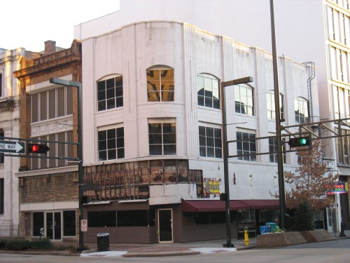
Take for example the building at the corner of 20th Street and 2nd Avenue North downtown, the Webb Building (originally constructed 1871–and among the first brick 3-story buildings in the city).

Cri de coeur

Owned for years by Southtrust Bank, it has been vacant for a while, and is now privately owned after Southtrust’s successors sold both it and the entire half block it sits in. You would be hard-pressed to find such a prominent corner on the most prominent north-south street in town looking so darn tawdry. Although very small in size, the corner position of this forlorn building magnifies a message to those passing by: no one cares about this corner. Although nearby large office buildings may have occupancy rates averaging over 90%, often that occupancy is invisible, occurring on the inside. What’s visible is this peeling facade, desperate for renovation. This small building ends up speaking louder than an office tower that’s 90% full just a couple blocks away. It’s all about the bad skin.

Pizitiz selling with good graphics

Just a block down 2nd Avenue is the Pizitz Building, another distressed building that would radio the same depressing message, except for one fact: it’s entire skin, intricate terra cotta and masonry, is slated to be meticulously restored to the standards of the National Park Service in an imminent restoration (more on this project soon). Assuming this project goes through, we’ll get the best of all worlds–both a beautiful skin and lots of human activity in the form of retail and restaurant tenants at street level. People exiting the McWane Center or IMAX Theatre will no longer confront a major symbol of urban blight, but instead a thing of beauty.

And again, beauty makes people happy. Leaves ’em with a smile on their face. That’s what great urban environments do.

Phoenix Building pre-renovation

All of that facade restoration is often quite expensive, when you’re dealing with old buildings–especially those that have lots of decorative elements in disrepair. When we renovated the Phoenix Building, we were not required to restore the terra-cotta detailing, or remove the paint from the original copper transom frames. The federal Historic Tax Credit program let’s you choose to leave such things alone. But we just couldn’t imagine renovating the building without making it beautiful on the outside again. In the street shot taken before renovation, you can see the copper transom frames painted over, and dirty, chipping terra-cotta details. The detail  pic shows how artisans remolded shapes to match the original terra-cotta that had chipped off long ago, and a sample of the copper being burnished and restored.

Old skin on the left -- new on the right.

Back on 20th Street, the Watts Tower was renovated just 10 years ago into apartments, but the skin…not so much. This building, an Art Deco tower designed by local firm Warren Knight and Davis in 1927 (replacing a charming Commercial Second Empire style 1888 building of the same name), derived much of its original, streamlined, simple beauty through the contrast of its vertical brick spandrel/window stripes with terra-cotta at the corners. In 1977, the whole facade was “modernized” by painting everything a bland cream color. When the renovation occurred in 1999, this unfortunate situation was unremedied. Almost worse, certain windows were boarded up on each floor and ugly exhaust vents were unceremoniously stuck in their place.

sad skin

Add in the lack of a building standard for window treatments, and the lack of anything graphic telling you there’s something new in the building (except for some very off-the rack “for rent” and “for sale” signs)—-and you end up with a very sad looking skin. If I were a visitor looking up at this building, I would guess it was a low-rent apartment building redeveloped in the 1970s, not a high-rent condo building redeveloped just 10 years ago.

Watts Tower in better times, before the paint and the neglect--and the window vents

K can be tentative about her relationship to an urban environment. Sort of like a residential neighborhood where you see one house abandoned with windows out–it makes K want to keep driving to a better neighborhood. And when K sees one building downtown with bad skin, or several running down a street–this doesn’t make her want to linger. It makes her search for another, happier neighborhood.

OK K.  We will get right on it.  Better skin in Aisle 2.

Skate park!

Skating: essential to any urban environment

When we developed 2nd Row here on 2nd Avenue North, we were delighted to bring Faith Skate Supply and its owner Peter Karvonen into the neighborhood. Skating has become ubiquitous in urban America, and your city lacks edge if it lacks a decent skate scene. Unfortunately, unlike Nashville and Chattanooga, Birmingham does not have a central skate park that’s fun, safe, and available to all. (thanks to mississaugamuse for the pic of the boy safely skating in a purpose-built park).

Skating, according to a Memphis site devoted to a similar deficiency in that city, “is a positive physical outlet needed for our youth and it’s an activity that naturally forms friendships among participants coming from a wide range of socio-economic backgrounds.”  Peter is particularly interested in how younger kids, those with autism, and kids prone to obesity can benefit from the exercise provided by skating. To that end, he’s helped organize an art auction to help raise money for the Magic City skatepark effort  this Friday at Urban Standard at 6:30 PM (this interview from Transworld Business helps explain the intersection of autism and skating).

As Peter points out, it is often more difficult to build a skate park in a large city than a small one, due to the more complex land uses, zoning rules, and ownerships involved. He has been working with the City of Birmingham for the last number of years trying to identify a piece of City property appropriate for a park. The City would donate the land, and at this point the construction funding would come from elsewhere. Peter knows one thing–any park will have a special section set aside for younger kids and those with autism.

One really interesting example of how a smaller city saw the positive urban value of a skate park can be found in Greensboro, AL where Auburn University architecture students have designed a compelling and economical place for skaters:

Rendering of Greensboro skate park

Here the park nestles into the landscape: a sculptural element that’s visually appealing as well as functional. Thanks to the Auburn Rural Studio for the rendering.

One of the reasons why the smaller skate park (ideally it needs 30-40,000 square feet of area) closed in Homewood Central Park was due to complaints from neighboring residents in new, high-priced condos. It seems (surprise surprise) that the often loud rattling and thumping of skateboards do not mesh with condo quiet-time. While the Birmingham City Council, Mayor’s office, and various community leaders all support the idea in theory, a sort of NIMBY-esque excuse is found for just about any desirable location (i.e. “we love the idea for the city, but it just wouldn’t work with the sort of people/businesses/investment we are trying to bring to our proposed park/development.”)

A completely different, inclusive take on skateboarding: Peter sent me an article about architects designing skate-friendly buildings: this pic (courtesy quon) illustrates how the new Olso Opera House designed by the Norwegian firm Snohetta is essentially a series of ramping surfaces anchoring the structure into the land, dissolving it into the sea, and–in theory–providing plenty of fun for skateboarders.

Ramps and opera in Oslo

There are plenty of stereotypes out there about skateboarding. In reality, kids (and adults) are getting exercise, staying out of trouble, and making new friends in (ideally) a safe, purpose-built environment. I strongly support the construction of a super-cool skate park in a central location in the City. The sooner this happens, the happier Peter–and his legions of local skating followers–will be.

Hungry for more

Today’s light-hearted Friday post is about restaurants. Eating out has been an essential part of the urban fabric in bigger cities (starting in the late 19th century); in the last few decades, it’s become pretty essential all over the place. Birmingham has more than its share of excellent restaurants at the high end (think Highlands, Cafe Dupont, or Hot and Hot Fish Club), or at the economical end (think Rojo, Makario’s, Zoe’s). Unless you’re at a typically mediocre chain restaurant, there are fewer options at the middle end (Trattoria Centrale, please start opening other nights besides Friday!–thanks to bradford for the pic).

The chef at Trattoria Centrale turns out some amazing pies downtown

This is why we’re excited about two things: one, we hear that Urban Standard is planning to start regular dinner service offering innovative, casual dining under the able stewardship of Chef Zachary Meloy. This place has become a community hub, not just for the neighborhood, but for many others who feel right at home when they visit. My hope is this knitting together of community will now continue into the evening hours on a regular basis.

Second thing: as many now know, a new restaurant called Brick and Tin is set to open in a few months on 20th street in the former “Dress for Success” storefront. (photo courtesy pallid7) Chef Mauricio Papapietro (who, like one of the chefs at Trattoria Centrale across the street, trained under local superstar Chef Frank Stitt), plans a gourmet sandwich place that will focus on lunches initially. Dinner will hopefully follow soon.

For most people, whether consciously or not, the architecture and ambience of a restaurant at any price level is an important part of the experience. You expect a lot of thought to go into restaurant interiors at the upper end, but it’s nice to go to more moderate restaurants and find exciting design as well. This tends to happen more often in larger cities where the importance of hiring a good designer is seen as necessary for business, rather than an expendable luxury (or even a nuisance) as is too often the case in a smaller place like Birmingham.

Flip Burger is an example of a moderate restaurant here with a very high quotient of design. From the logo, to the menus, to the booths, to the food itself, everything is rigorously thought out and tied to a strong central concept.

High Design at Flip Burger

In the big picture, there’s nothing truly original about Flip Burger’s concept–hip, design-heavy fancy-burger spots have proliferated across New York City for a couple years now. But this is a rare instance in Birmingham to see such a thorough design concept carried through from start to finish in a restaurant. And refreshingly, there’s nothing conservative about this design either–no stained wood chairs, “retro” pendant lights, or any of the other banal elements that are too often strewn over our dining landscapes in town. (photo courtesy cathydanh)

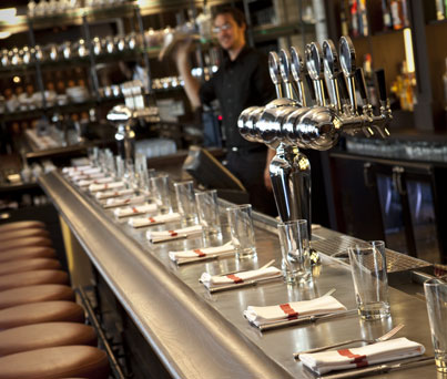
Back to Brick and Tin–while I’m not privy to the design plans (local firm Hendon and Huckstein has been engaged), the name reminds me of English or neo-English gastropubs. Helping revitalize the food environment in a country until recently not known for innovative cuisine, the gastropub refers to an older pub (which used to just serve beer, spirits, and snacks) which has been converted to serve full meals, often with a gourmet bent, moderately priced, and riffing on traditional English cuisine. In this country, it has a broader definition (as there are no real historic pubs to convert): a moderately priced restaurant with design cues taken from the UK’s typical pub, and where beer  can take precedence over wine as the beverage of choice with dinner. An example is the new Againn gastropub in DC.  Sitting at the long bar (or in booths) enjoying good food and beer at moderate prices within a charming, well-designed environment is the sort of thing we need more of here.

Againn gastropub in DC

One last word (for now) on restaurant design: one of my favorite designers, Karim Rashid, was asked several years ago (actually 2001; I can’t believe it’s that long) to design the interior of Morimoto in downtown Philadelphia–a city which, like the UK, was not terribly known for its cuisine (Philly Cheese Steaks excepted). This is an incredible example of high-concept restaurant design, and an early innovator of integrated LED lighting (the booths and walls slowly change colors as you eat). It also inspired many other restaurants to open downtown, and now the restaurant scene in Philadelphia is transformed. Here’s to more options, better design, and new cuisines coming to town. And yes, I would love Karim Rashid to collaborate on a restaurant design with me someday. Right here in downtown Birmingham. (Morimoto pic courtesy bombtrack)

Morimoto revitalizing downtown Philly

All together, now.

This past week the News confirmed an open secret: IMS, a company specializing in surgical instrument management and consulting, is relocating from suburban Homewood to downtown Birmingham. 100 employees will populate the former Noland building and warehouse (2nd Avenue North and 33rd Street), with additional space to be built on adjacent property. The “Sloss Business Park” would involve an (initial?) investment of $7.4 million.  ONB, the BBA, and the City are all mentioned as having helped make this possible. It is a too rare example of a corporate headquarters moving into the city. Here’s hoping others will follow.

Wellmark anchors a downtown district in Des Moines

In the meantime, Wellmark Blue Cross and Blue Shield is building a new headquarters in downtown Des Moines (thanks to jeremye2477 for the construction pic). It will house close to 2000 employees and represents a $250 million investment. Now, don’t get me wrong. I’m excited as anyone about IMS (and hopeful that the architecture and planning of their new campus will be urban, forward-thinking, and inspirational). But, this comparison illustrates how far behind Birmingham is when compared to recruitment and retaining efforts in other cities, and the impact those efforts have in creating urban place.

As the New York Times pointed out in an article Feb. 17, Des Moines in recent years has thrived on cooperative efforts to improve and expand downtown. There are about 75,000 jobs downtown today, up 20,000 since the mid-1990’s. Birmingham has roughly 80,000 jobs downtown, but this number has been rising much more slowly in the same period. While we tend to have good plans for growth that sit gathering dust on shelves while factions squabble, there is a sense of common purpose in Des Moines–that a healthy downtown does not have to exist at the expense of a healthy metro. Instead, area leaders there see the health of the entire region depending on the health of downtown. They have cooperation. We, with some notable exceptions, do not.

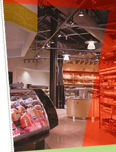
Businesses want to invest in a downtown that’s embraced by the wider community. Instead of feeling like a pioneer, you feel like part of a plan for success. The plan in Des Moines includes a Regional Account, paid into by both city and suburbs, that helps provide stable funding to civic amenities like the art museum, symphony, botanical garden, etc. Here, these institutions often struggle year to year, depending on the whim or largesse of politicians and donors. The stability of Des Moines is part of what influences businesses like the Gateway Market to open downtown with confidence.

Gateway Market in downtown Des Moines

Main Street art in Chattaooga

Interestingly, Des Moines spends a set amount ($250,000) per year on public art. In Birmingham this would generally be frowned upon as frivolous. But just look a couple hours north to Chattanooga, where their public art fund has helped to revitalize the entire Main Street Area. In Birmingham, public art is the first aspect of a project to be chopped or deferred. In Chattanooga, it’s the opposite: art is used on the front end to attract attention and development. In this photo, you can see large, public art that was installed on an almost abandoned Main Street. 2 years later (when I snapped this pic), the neighborhood is thriving with shops, restaurants, and lofts. Oh, and a grocery just announced it’s arriving soon.

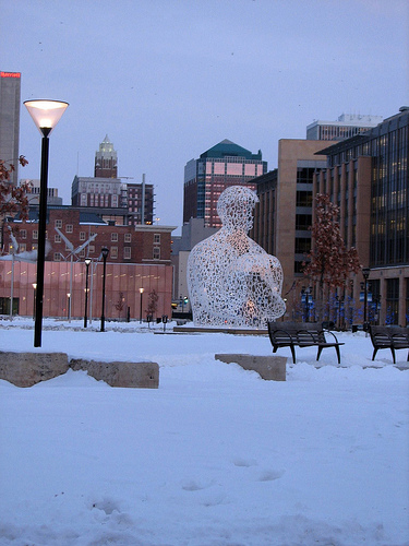
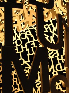
Western Gateway Park with sculpture

I love the idea of a human head/torso created with large, interconnected letters. Uplighting at night is beautiful.

One project in Birmingham that offers a contrast with Des Moines is the Railroad Park. In Des Moines, the new Western Gateway park was opened with unusual speed–2 1/2 years. Not only is it filled with large public sculpture, but it has already attracted new development such as the Des Moines Social Club, a multi-use art center with big ambitions. Thanks to Lukeh and regan76 for the full and detail pics of the Jaume Plensa sculpture in the park.

Back in Birmingham, the Railroad Park is indeed one of those rare examples of cooperation among many parties. In contrast to Western Gateway, it’s taken about 15 years since first conceived.

The public art component has been on again, off again, illustrating this community’s ambivalence to the real power of public art.  There have also been other cutbacks that some worry will dampen the final product.  But there remains a sense of optimism that, when this park opens later this year, it will become a catalyst for development. Let’s hope that our community doesn’t just sit back and nervously hope for the best, but instead focuses serious effort to making sure the park and its surrounding blocks are seen as a regional amenity that can help bring new corporate headquarters to Birmingham, inspire our own multi-use art spaces to crop up, and generate the interest of small business (and grocers) to the center city.

And maybe, just maybe,  even help reset our “cooperation” button. We need to unite to get things done. Hey, if they can do it in Des Moines…

Mind the Gap (2)

The site, within an indeterminate cityscape

I realize we’re all due for some new posts; a deadline in the office has prevented me from publishing in the last few days (though I have a long list of topics just itching to get onto the blog). Hang in there for a couple more days.

In the meantime, let’s jump to Anniston, Alabama about one hour’s drive east of Birmingham. The city has a population of some 24,000, and the metro about 110,000. Its central core, while home to some great historic buildings and some revitalization, feels frayed and pock-marked in many places. Like many other cities, the energy has shifted to the suburbs, especially Oxford.

Downtown Anniston, feeling a little frayed

We were commissioned to design a new dental clinic on a lot at the edge of the business district, where the city starts to transition to neighborhoods. The property was an empty corner, surrounded by suburban-styled parking lots and unmemorable, one-story buildings, as well as some older houses across the street. The owner wanted to make a statement to the city about confidence in its potential growth. This was an unusual part of town for this sort of investment, that’s for sure.

So we designed a building that, rather than sitting back behind a parking lot, comes right up to the corner, with the parking tucked behind it. We used a combination of metal panels and stained wood for the exterior; the interior is high-ceilinged with lots of glass to try to dispel that typical “dentist office” feeling.

While small, the building has already surprised some locals, used to suburban investment and parking lots, not architecture that proposes a more urban edge on the street.

holding the corner

We’ll see if this building (just opened recently) might inspire others to reevaluate the importance of the central urban fabric, and to consider fresh ways of redeveloping un- or under-used property.

(downtown Anniston pic courtesy markbajekphoto1)

And for anyone interested in seeing the site plan, click here: SD 2010-03-12 SITE iii

Woof!

Sometimes recessions bring out interesting entrepreneurial efforts (see architects selling ice-cream in my post below).  Sue and Jimmy Johnson have purchased the former Hunter Furniture building on 18th Street North and plan to open a “doggie day care” facility, the first of its kind downtown. The owners intend to create a loft upstairs for their residence. While primarily known recently for its electric turquoise coloring, this building has a special place in local urban history: when almost the entire block was razed for a promised but never-to-materialize development, Hunter Furniture refused to bend to pressure. Today it stands alone amidst a sea of surface parking, a (rare) testament to grassroots resilience to the destruction of urban fabric.

People who live downtown tend to have dogs; walking dogs in the mornings and evenings helps foster community, creates pedestrian (and canine) foot traffic, and makes streets feel safer. While most residents are happy to finally have a dog park at George Ward Park, as yet there is no dog park downtown to which people can walk their furry friends. I’m hoping that the local Bark for a Park group will find a great place soon to start downtown’s first dog park. It doesn’t have to be big. And there are plenty of physical places where, in theory, you could locate one. Take a look at the Deep Ellum Dog Park in downtown Dallas for an example of what we could do here.

I also hope the Johnsons will figure out a way to preserve the old Hunter neon sign on the building; in my opinion signs like this should be landmarked and a special fund set up to help owners preserve them (the cost of restoration and operation can be daunting). A future post will discuss the importance of projecting signs and graphic imagery in dense, urban areas. But I could not resist posting this wonderful shot of Hunter Furniture and 18th Street from the mid-1970’s, before the wholesale demolition all around it.

Here you see the old WBRC-TV studio next door, the old Pasquale’s pizza downtown location, and a series of other businesses marching up 18th Street. Almost all these businesses are now defunct or demolished; Hunter wasjust about the lone survivor from this era (it finally closed in November, 2009).

It’s a shame that after all these years, the parking lots surrounding Hunter are still…parking lots. If this site could be redeveloped with new businesses, living units, restaurants, a shared parking deck, and maybe a small (dog-friendly) park, I’m convinced that fantastic older buildings nearby would see renewed interest in redevelopment (i.e. the Thomas Jefferson Hotel).

And the Johnsons could get some more 4-legged customers.

(pics courtesy army.arch, top; JCMcdavid, bottom)