Category Archives: Uncategorized

Art and the City

We like the logo

At Design Review this morning, KPS Group presented a design for a new outdoor seating balcony for the Birmingham Museum of Art‘s restaurant, Oscar’s. While it’s exciting that this newly branded restaurant is opening up to the outdoors (facing the landscaped walk between the museum and Boutwell Auditorium), it is less exciting that–for various reasons–the Museum has not been able to move forward with expansion, either onto the adjacent Boutwell site or otherwise. Our amazing collection, considered one of the finest in the country and perhaps the best in the southeast, deserves better.

Imagine Boutwell–or perhaps the Alabama Power Steam Plant facing the Railroad Park–becoming our own version of the Geffen Contemporary in downtown Los Angeles (below), really putting Birmingham on the map for contemporary art. The soaring space, flexible layout, and “un-museum” feel would be exhilarating. Not to mention the ability to spawn other development nearby, all while increasing our tourist base and allowing more of our collection to be shown.

Murakami needs high ceilings

Or, think of the Mattress Factory in Pittsburgh, where an old factory building was transformed into a cutting edge exhibition, performance, and gallery space, with artists-in-residence brought in from around the world. We looked at this for a model at our Phoenix Building development, but we’re still searching for a way to bring this sort of vibe to Birmingham. The picture below proves that yes, appreciation of contemporary art can begin at a very young age.

Training the eye

Our Museum is City-owned and open to the public at no cost–a rarity in this country. Despite the economic woes of both the private and public sector right now, here’s hoping that in the near future we’ll have a cutting-edge expansion of this institution that’s so essential to the City’s culture.

It can be done here too

[thanks to Matt Niemi for the Mattress Factory kid; beastandbean for the Murakami exhibit at Geffen; and Mattress Factory for the exterior shot]

Dead customers can’t buy a lot of chicken

At yesterday’s working session of a subcommittee of the Design Review Committee, Chick-Fil-A came back once again with a revised proposal for the heavily trafficked NE corner of Highland Avenue and 20th Street South in the heart of Historic Five Points South.

A move in the right direction, but not enough

A summary of the session can be found in the News here, or over at Second Front here. Suffice it to say that while the site layout–and the drive-through’s impact on the layout–is still a serious concern of the subcommittee, the design of the building itself has undergone a sea-change from earlier versions. Local firm Cohen Carnaggio Reynolds has been hired by Chick-Fil-A to try to win over hearts and minds. What exactly is at issue with the design of the building?

The quick sketch above roughly illustrates the difference between earlier schemes–which showed a typically suburban “outparcel” site strategy (#1 above)–and the current scheme presented yesterday (#2 below). Whereas before the building mass was dwarfed by the relative sea of surrounding asphalt parking (and drive-through), now the building has been elongated to take up over 80% of the street frontage on both streets. The parking and drive-through are now fairly well hidden from either street. (Please note these sketches are not to scale.)

From an urban standpoint, this is a good thing. Urban neighborhoods depend on density for their success as dynamic environments. It’s pretty intuitive: how many of us have visited a dense environment like Manhattan and walked a mile without noticing? Whereas in a less dense environment, like most of Birmingham, most of us really notice–and avoid it–if we have to walk more than 1/2 block to a destination. When we don’t have a dense, vibrant, interesting wall of buildings fronting the street to hold our interest and make us feel secure, we don’t want to keep walking. Brightly lit storefronts keep us walking; big parking lots don’t.

How did the architects stretch out this new, 291 feet of facade? While actual floor plans were not presented, it appears that a lot more seating was added–both interior and exterior, some under a covered pergola. And how did they respond to the Appeals Board’s decision to deny Chick-Fil-A in part because the building previously presented was clearly purpose-built for Chick-Fil-A, rather than as an adaptable commercial structure more typical to the area?

The response was to offer several possible versions of how the building could look. In each one, the building was imagined as a simulation of organic growth over time, dividing up one facade into 3 parts, with each part resembling a somewhat different building. While this sounds reasonable in concept, it is very hard to pull off, especially if the same architect is designing the entire project. Simulating architectural diversity that normally occurs organically, and over time, often results in a “Disney Effect”, where the street ends up looking like a stage set.

A simulacrum of the real thing

Take the outdoor street and commercial “facades” at Brookwood Mall, pictured above. While the design has certainly improved the mall from a planning standpoint–opening shops onto an outdoor sidewalk, facing new restaurants, with parallel parking and street trees mimicking an actual urban street–the architecture itself is disappointing. Because despite the effort to modulate the elevations, with different heights, setbacks, and architectural “styles”, the whole thing still looks like it’s one big mega-project that came from the same hand. Why? The level of detail is consistent; while from facade to facade the brick may differ from the stucco, and the impressed tiles differ from the cornice, overall there is a similarity in both material and design quality that makes the experience more homogeneous than diverse. If the developer had one master plan, and hired multiple architects to create the facades using certain guidelines, then the results would have had much more potential. Of course large-scale commercial development rarely goes that way.

Rather than simulate 3 buildings, I think it would be more fruitful to consider one consistent building, and vary the scale along the facade to achieve a certain diversity and rhythm.

A post-modern infill down the street

Interestingly, the Committee towards the end (with Cheryl Morgan leading the discussion) urged the architect to not depend on historic precedent to such an extent that the buildings look like imitations of Spanish Revival or Art Deco, two common styles of the Five Points area. “Contextual” and “Compatible” do not mean “Imitation”; Morgan pushed for a “21st century solution” that, while clearly new and  of this time, responds in a respectful way to the scale, rhythm, and massing of the eclectic neighboring buildings. Too often when new buildings are designed to be “Tudor” or “Spanish Revival”, modern budgets and available craftsmen make the details very disappointing compared to the models of 100 years ago. Above you see an example at Pickwick Place a couple blocks north of the proposed site, where an infill project in the early 1980’s gave us stucco facades with end piers and grooved details meant to evoke the 1930’s Art Deco of the Pickwick Hotel to the south–but while the massing feels right, the paucity of detail, the banal storefronts, and the cheap looking light standards, clumsy railings,  and ugly metal coping all say “1980’s on a budget.”

21st century contextual

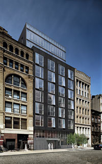
This residential project at 48 Bond Street (designed by Deborah Burke) in New York is an example of a confidently modern infill structure that manages to respect and respond to its neighbors without imitating them. It matches the parapet heights of its neighbors, recessing its additional stories back from the street line; it uses proportion and material to relate without copying. And frankly, even with New York budgets, copying historic elements is almost bound to disappoint once you start designing details. And details can make or break a project–as Committee member Mark Fugnitto stated, the details will determine whether the proposal is a good or bad building. And, as this is still a work in progress, we  don’t have the details yet.

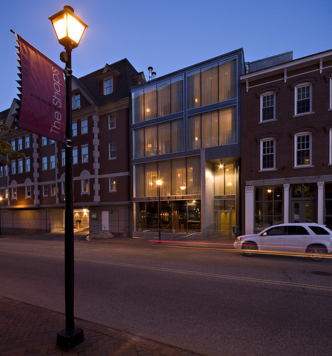
Another example of sensitive modern infill architecture that doesn’t try to imitate the past is the Portland Harbor Hotel annex below in Portland, ME. Designed by Archetype, this project proves you don’t have to build a corporate template, or imitate the past, or simulate diversity, in order to create something both substantial and adaptable to other uses in the future.

Elegant and substantial

Now, what still remains–and what the architect can’t fix no matter how hard she tries–is that Chick-Fil-A is still hell-bent on a drive-through, on a single-use for the entire site, and of course on their no-Sundays policy. I think all 3 of these represent big flaws to the development of the site.

First, a drive-through is incompatible in this neighborhood.  Chick-Fil-A’s traffic engineer stumbled a bit yesterday when he finally acknowledged that the famous “47 second” average drive-through wait–“the best in the business”– was actually 47 seconds from placement of order to receiving that order. You can wait much longer to get to the box and ramble through the order itself. So at peak times, it is all too easy to imagine the stack of cars spilling out into the parking area and creating traffic hell all around the site, which is already hellish enough. Couple this with the fact that people are not getting out of their cars like everyone else in the neighborhood and walking to their destination makes me–and most of the committee–still skeptical that the drive-through can be proven compatible with the neighborhood. [A friend of mine just timed his drive through experience today at the Eastwood Village CFA location and clocked 374 seconds total from entry to exit–and this was a good 20 minutes before CFA’s stated “peak time” of 12:15 to 12:45.]

Second, while it’s admirable that the company is now willing to reduce total number of parking spaces, and simulate multiple storefronts across a wider street frontage, this is no substitute for true urban diversity, with multiple businesses located adjacent to each other. This prominent site is much better suited for mixed-use than for single-use, and while CFA admits they have “more property than they need”, they refuse to entertain the idea of subleasing out a portion to another business. Hardly surprising, but still disappointing (and disappointingly beyond the purview of the Design Review Committee).

Finally, while somewhat unspoken (and again beyond the DRC purview), it is truly a shame that, because of CFA’s policy of not opening Sundays, this important intersection in one of the most popular urban destinations for locals and tourists alike would be completely dead for a full half of every weekend. Not the schedule you want in one of the few dense, around-the-clock neighborhoods we have in this city [Pancake House: you need to open for dinner!]. And speaking of the Sunday closing: CFA is known for hiring only clean-cut workers with proven “family values”; its corporate office financially supports such groups as Focus on the Family, a controversial organization that campaigns against gay rights among other things. The fact that the Five Points neighborhood is one of the most demographically diverse and accepting in the entire state at the very least lends an irony to CFA’s desperation to be there.

When the traffic engineer was grilled on vehicle counts and flows, one objection was conflict with pedestrians at various points around the site. His reply was that of course CFA wants to avoid pedestrian accidents: “Dead customers can’t buy a lot of chicken.” Oddly enough, that quote seems like a good way to sum up this entire effort thus far. Stay tuned.

[thanks to KMGough for the Portland infill; Deborah Berke for 48 Bond Street]

Design Review Alert

The Design Review Sub-Committee will hold another “working session” with representatives of Chick-Fil-A to “review Chick-Fil-A’s latest design proposals” for a new restaurant on the corner of Highland Avenue and 20th Street South in the heart of the Five Points South Historic Neighborhood.

The meeting will be Tuesday, July 20, 2010, at 4 PM in the 5th floor conference room at City Hall, and is open to the public. However, unless requested by the Sub-Committee, no public comments will be taken, and seating is limited in this conference room. For those who cannot attend, I will do my best to report the proceedings.

No rulings are made at the working session.

Details, details

A lot of our time recently has been spent on big issues: form based code, new urbanism, corporate footprints within historic neighborhoods, major public greenspace. It can be equally useful to examine the myriad small details that go into our built environment–the ones that are often taken for granted.

Today’s Design Review Committee meeting was a good place to reflect on these small things (and the hard work–often thankless–that this volunteer committee puts into all considerations, large and small).

Signs of the (changing) times

The Wachovia Tower (formerly the SouthTrust Tower, shown above right a few years ago before that merger with Wachovia) is now the Wells Fargo Tower. Executives from Wells Fargo presented a proposal to replace the current abstract Wachovia logo (approximately the same size as the old SouthTrust “S”) with a much larger “Wells Fargo Bank” that stretches across the blank, dark spandrel glass of the penthouse, repeated on each of the four sides. Noting the importance of the chamfered penthouse corners, the Committee asked for just a few feet of breathing room to either side, slightly reducing the size of the sign. After the WF people initially objected–claiming the sign as presented was the perfect size to be seen “from all the major interstates”–they bowed to the reasonable assertion that the sign should be proportionally correct to the building and pleasing to the eye for pedestrians, not just stressed-out commuters on the freeways. Who, as Committee member Cheryl Morgan pointed out, should really be “concentrating on driving” rather than gazing at distant signage.

Illuminated signs (and this one will be lit with expensive, but energy-saving LEDs) are important symbolic markers on a skyline. I’m happy this building–whose branding has long suffered with tiny, illegible logos, is now getting a well-proportioned, clear sign that lives up to the importance of the southeastern headquarters for a major national bank. And I’m happy the Committee insisted on a very small, but important adjustment–improving the view of this sign from the surrounding streets and windows in the CBD.

Clever retro aesthetic

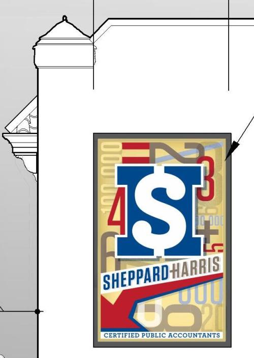
There were also two other, similar cases, both again involving signage. One, for Sheppard-Harris and Associates in Fire Station No. 4 in the 200 block of 24th Street North (my firm designed the exterior renovation), won approval for both a new projecting (blade) sign which will illuminate at night, and a new, painted mural sign at the blank side of the building facing a parking lot along Third Avenue North (shown at left).  Dog Days of Birmingham, in the 100 block of 18th Street North in the old Hunter Furniture building  (which was discussed earlier here), won approval for a new blade sign but was denied approval for a painted sign on its side wall facing First Avenue. Their proposed painted signage did not show much artistic creativity (in contrast to the Fire House sign, designed by The Modern Brand), which in part led the Committee to judge it banal and redundant given the prominence of the large blade sign around the corner. I’m a big fan of signage downtown–a full post to come on that soon–so I hope that we can see a new proposal for a more thoughtfully designed painted sign at this location.

Some other items:

1. A crude picket fence (in lieu of a proper railing) constructed without a permit at a porch of an historic Highland Park house that the Committee agreed should be replaced with something more appropriate to the house;

2. A new landscape plan for a small parking lot directly east of the new Marriott Residence Inn in Five Points South whose landscaping and paving plan was passed–but whose many, excessive “No Parking–Tow Zone”-type signs strewn across the site were denied;

3. New wood replacement windows in the Blach’s Building annex in the 300 block of 20th Street North (to accommodate new loft apartments planned for that building) that the Committee easily approved;

4. A renovation plan for the new Naked Art gallery in Forest Park commerical center, unanimously approved;

5. And a somewhat ingenious steel-framed parking deck slotted behind 11th Avenue South to service the newly renovated Terrace Court Apartments (and the general public) in Five Points South, designed by Cohen Carnaggio Reynolds–also unanimously approved.

All of these small-ish items aren’t big-ticket controversies or complex designs. But added up, these small bits (along with the larger and/or more prominent projects) help make our city’s environment special. One more pat on the back to the Design Review Committee for slogging through every item, however small, with an eye towards helping improve Birmingham’s built environment.

No parking deck required back in the day

[Full disclosure–the vote for my signage package was not unanimous: Chairman Sam Frazier cast the lone vote against, objecting to the blade sign illuminating at night. While perhaps unusual for a CPA to have illuminated signage, I felt it important in the burgeoning, (almost) 24-hour 2nd Avenue neighborhood for the company to have a night-time presence.]

[thanks to hannerola for the SouthTrust pic and Dystopos for the historic Terrace Court pic]

The bulldozers are coming

The way it's usually done

Over in one of our alternative papers, Black and White, associate editor David Pelfry has an editorial exploring the relationship of developers, municipalities, and citizens—and the large imbalance often inherent in this relationship which can lead to the loss of green space, beauty, and community values in the name of tax revenue. Whether you are concerned about the current Chick-Fil-A and Walgreen’s projects in the City, or recent shopping center, mega-subivision, and other developments in the greater Metro, it’s a very interesting read.

[thanks to Robert Burnham for the aerial pic]

Chick-Fil-A: we’re back!

Still trying to make a suburban model urban

I found out at very late notice that a subcommittee of the Design Review Committee was meeting today at City Hall in a working session with representatives of Chick-Fil-A, to discuss a revised proposal for the prominent site at the corner of Highland Avenue and 20th Street South in the heart of Five Points South. As many already know, their previous proposal has been denied twice: once by Design Review, and once by the Appeals Board just a couple weeks ago.

So it was with great interest that I hurried to the meeting to observe the proceedings.

First, subcommittee chairman Richard Mauk laid out the guidelines–that the subcommittee expected Chick-Fil-A to respond to each of the points laid out by the Appeals Board. The implication was: if you don’t address each point, then you don’t have much chance of success with a new presentation.

Chick-Fil-A started their presentation, once again using a site plan showing no surrounding buildings or other neighborhood context. This is Presentation 101, especially when you’ve just been raked over the coals for not being sensitive to the neighborhood. Besides the lack of context, the site plan was most notable for still containing a drive-through, and for still containing the same basic proportion of building mass to open parking (2 of the main concerns of both previous “No” votes).

While the Chick-Fil-A in-house engineer was attempting to explain the plan, committee member Don Cosper asked why the location needed so many parking spaces when only 21 are required by code [almost every surrounding business has a variance on parking and very few have on-site parking at all]. The answer from the Chick-Fil-A traffic engineer was, “we just have a large site so we are filling it with more parking than we are required.”

What ensued was a somewhat circular discussion, with Design Review members Mauk, Cosper, Cheryl Morgan, and Mark Fugnitto continually reminding Chick-Fil-A about the importance of neighborhood, pedestrians, and context, and Chick-Fil-A appearing a bit caught off -guard (again, despite the appeal process they’ve just been through). The company has now hired an outside design consultant (architect Bill Allswell–I’m afraid I’m not spelling his name correctly). This architect also presented two proposed exterior elevations, one which he admitted was “more suburban” and one which was “more contextual”. Neither was aesthetically very pleasing, though each tried to extend the mass of the actual building with some false screen walls.

Morgan was especially adamant that false screen walls do not substitute for active storefronts engaging pedestrian life in an urban area. She summed it up by saying that CFA still has a very suburban plan, and they need to return with something new, at which point the “working committee” would meet with them again.

All in all, a somewhat bizarre meeting: with all the resources CFA has, and all they’ve been through, you would think they would have a more sophisticated visual presentation, and one that truly addressed the points in the Appeal Board denial. Instead it was 95% more of the same.

I will try to alert everyone to the time of the next working session, assuming it’s open to the public again.

Finally, looming in the background but mainly unspoken today: the drive-through. Still in the plan. Which is bewildering.

FOOTNOTE: out of courtesy to the designers presenting, I’m unable to show any of their draft renderings on this blog.

[thanks to link576 for the Chick-Fil-A bags]

Saved?

The City’s Economic Development Committee this afternoon unanimously voted to recommend the Walgreen’s project on Clairmont Avenue and 32nd Street to the full Council.

Still fighting fires in 1976

Originally Walgreen’s had planned to demolish Fire Station No. 22–and two neighboring long-time businesses, Bogue’s Restaurant and Clairmont Auto Repair–for a new store and parking lot. After an explosion of neighborhood opposition to the demolition, and frustration at the lack of public awareness of the City sale of this property, Walgreen’s amended its proposal. Now, the company promises in writing to preserve the Fire Station and make efforts to move Bogue’s into it, or find another neighborhood tenant. The new drug store would be placed in the middle of the block, leaving the historic corner building in its role as gateway marker to the Highland Park, South Avondale, and Forest Park neighborhoods.

Once Walgreen’s changed their plan to include preservation (the community had reminded the developer, Connolly Net Lease, that Walgreen’s had agreed with the National Trust to not demolish buildings on the National Register some years ago), a lot of opposition died away. While it is true that the current proposal is immensely better than the previous, it is probably important to remain a little skeptical–this large corporation had no initial intent to save the fire station or help displaced businesses. Let’s hope their new spirit of community cooperation is genuine.

Walgreen’s committed to holding a design charrette for the proposal, with public input. They have also engaged David Blackmon of Blackmon Rogers Architects to lead the design process. Here’s hoping for an inspired design for the new building; carefully planned and shielded parking; clear pedestrian emphasis at entry points; a skilled restoration of the fire station; and a commitment from the City to help both Bogue’s and Clairmont Auto find new homes. Oh, and a new policy that whenever the City is selling property–especially property on the National Register–they at least put up a “For Sale” sign, so the community, and not just RFP insiders, is aware and able to make proposals.

A big step in the right direction. Now come the important details. Stay tuned.

Where to get that Grapico

A local affair

Mamanoes, the new convenience grocery store opening in the former Gypsy Market space in the 2300 block of 2nd Avenue North downtown, will have its grand opening tomorrow (Thursday, July 1). Sources tell us it may take another couple weeks to be fully stocked, but we are all keeping our fingers crossed that a combination of business savvy and neighborhood support will make this a winner.

And hey, how can you not be optimistic when the first window display is a celebration of two home-grown fizzy favorites, Grapico and Buffalo Rock Ginger Ale?

Checking in?

Essential urbanity

By one definition, cities are fundamentally places where strangers can meet to exchange ideas. The urban sociologist Richard Sennett writes extensively on the public space of cities, and how crucial public space is to the exchange of ideas. Public space means not just streets and parks, but cafés, coffee shops, bars, theaters, cyberspace–and hotels.

Hotels are so fundamental to experiencing a city that we tend to take them for granted. I have been an obsessed student of hotel history and design since I was a kid, fascinated by the layers of public/private spaces, and the mix of people found in these spaces. And I have been unhappy with Birmingham’s lack of a truly great hotel since I was aware of the term. Birmingham’s full-service hotels used to all be located downtown, and all within an easy walk of Terminal Station. The Tutwiler, Redmont, Dixie-Carlton, Thomas Jefferson, Molton and Bankhead were among the best known.

Today, the Tutwiler (in another building) and the Redmont remain, both considerable shadows of their former selves (pleasant enough, but lacking the amenities and vitality these hotels were once known for). The rest have disappeared. There is no longer a true 4-star hotel downtown (much less a 5-star), or anywhere nearby. Which is troubling for the state’s economic and population center, to say the least.

Hotels, in their best urban roles, facilitate the exchange of ideas through a very porous interface with the street. Lobbies, restaurants, bars, lounges, meeting rooms, ballrooms–these are often favorite places to rendezvous, and the multiple entrances facilitate easy access to visitors.  The streets around hotels are typically animated with people coming and going. A busy, bustling hotel signifies a busy, bustling city. Think about the Waldorf=Astoria Hotel in New York, where you can enter the lobby, ballrooms, various restaurants and bars all through multiple entrances.

Porosity on the street

Now back to Birmingham and our dilemma. Over the last decade, there have been numerous studies conducted that show the need for more high quality hotel space in the City Center, and several unrealized proposals. My own office worked on a proposal from Rubell Hotels out of Miami to convert the Thomas Jefferson into a 5-star, independent boutique hotel back in 2000; more recently the Regions Plaza Building was to have converted into a 4-star Marriott Renaissance brand.

If we did have more hotel options, what should they be? The currently proposed Westin Hotel at the BJCC is disappointing for several reasons. It’s location is BJCC-specific and less central than one would like; its ambition is to add room capacity for conventions, rather than to increase street life and provide multiple destination points for urban dwellers. Equally disappointing is the bland aesthetic of the building, which is described over on heaviestcorner.
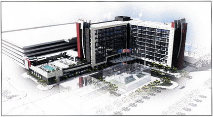
Westin BJCC: where's the urbanity?

To judge from the rendering, this is a slightly more upscale (and full-service) version of the limited-service Courtyard, Hyatt Place, and Residence Inn hotels that have opened downtown recently–welcome expansions of our options, but hardly more than clean, efficient places to lay one’s head. Similarly, this Westin appears to have no aspiration to capture the soul of a community, inspire visitors, and lure citizens and travelers alike to linger in its public spaces. The Westin proposal–while satisfying the need for more hotel rooms for users of the BJCC–is not the type of hotel that integrates into the larger urban fabric, with diverse appeal and street porosity that create public interaction.

When we think of certain cities, iconic hotels which seem to embody the city’s soul come to mind. Think of Paris–gorgeous, sophisticated, elegant Paris, whose ancien regime glamor can be summed up by the Hotel Crillon, perhaps the world’s first true luxury hotel (and a favorite haunt of Marie Antoinette).
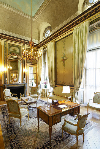
The Hotel Crillon personifies Paris

All marble, gilt, and tapestries, the Crillon exemplifies Paris, and has served as a model for countless grand luxury hotels to follow, from the Willard in Washington, DC, to the Plaza in New York City. When in the Crillon, you have no doubt where you are; there is no generic corporate color scheme or bland, universal detailing to make you think otherwise. It’s all very haute couture. Very Paris.

Hotels don’t have to be 250 years old (or just look that way) in order to become iconic. Take the Delano hotel in Miami Beach. While other boutique hotels (such as the Albion) were the first to renovate delapidated, boarded-up hotels into chic new playgrounds for a resurgent Miami Beach, the Delano was the first to really do it on a grand scale. Suddenly everyone wanted to be at the Delano, and it was the model for many subsequent hotel renovations in the area. It also helped designer Phillippe Starck become the mega-star he is today. The Delano became the “see-and-be-seen” venue for Miami Beach, perfectly capturing the feel of a breezy, celebrity and image- conscious contemporary city.

The Delano public spaces mirror the city beyond

Where does this leave Birmingham? While all those chains are a necessary part of the corporate travel world today, we are missing that one place that you’ve got to go to–whether reserving a room, meeting friends in the bar, having a special dinner, or just people-watching in the lobby. It should be somewhere special that both reflects local culture, but also rises above mere reflection to become inspiration.

Over in Louisville, KY, two local art collectors helped finance the 21c Museum Hotel in 2006 due in part to frustration that the city lacked an inspired hotel. Just a few years later this hotel won Conde Nast’s Reader’s Choice Award for best hotel in the US, and 6th best in the world—no small feat considering Louisville is not on the tip of everyone’s tongue as a destination.

21c: stylish and local

Adjacent historic buildings downtown were renovated (design: Deborah Berke, one of my favorite architects in NYC) with open, crisp modern spaces inside, lots and lots of contemporary art, and a super-stylish restaurant called Proof on Main adding vibrancy to the street. This has not only become a favorite meeting spot for locals and visitors alike, but plans have been made for extending the brand into other cities that would benefit from having a non-corporate hotel, which is dedicated to helping revitalize the city through contemporary art.  We’ve got an amazing Museum of Art and wonderful private collectors here. It’s worked well in Louisville–why not Birmingham?
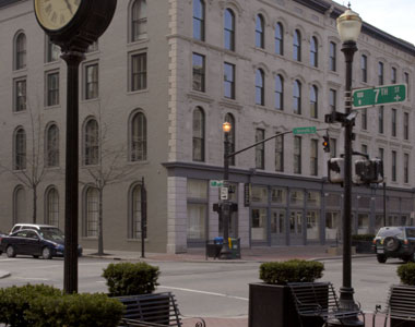
Art + Hotel = rejuvenation

I will leave you with this quote from Michael Bonadies, CEO of 21c, upon winning the Conde Nast award:

“Too often today, hotels are bland, isolated oases within cities that provide accommodations and dining but are removed from the city’s character and residents.

Thanks to 21c’s accessibility and social vibrancy, our guests have the opportunity to gain a real sense of the people and culture of Louisville as well as contemporary art from around the world. We are honored to be recognized as a destination for this great city and for travelers from around the country and the world.”

Yes, sometimes it takes a great hotel to not just help rejuvenate a city, but to put it on the map.
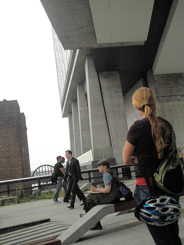
Integrating into the fabric

(PS: I couldn’t resist this pic of the new Standard hotel in NYC, hovering over the new High Line park in Chelsea. It brings interaction with the public realm into a whole new dimension.)

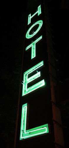
[thanks to tristan appleby for the neon pic; wallyg for the Waldorf; Concorde Hotels for the Crillon; saracino for the Delano; stlbites for 21c Restaurant; Conde Nast for the 21c exterior; Photogrammaton for Standard NY]

Anticipation (2)

Is this really downtown Birmingham?

Yesterday evening Katherine Billemeier (Executive Director of the Railroad Park Foundation) took me and a few others on another tour of the Railroad Park, which is now slated to be open Labor Day weekend. Once again, I was dazzled by the promise that this great open space holds.

The transformation continues

As it gets closer to completion, there are two things I’m thinking about:

1. The entire community must embrace this place as its own, using its walking paths, picnic grounds, plazas, play areas, lakes, skate bowls, and flower gardens as often as possible.

2. The City must quickly focus on a short and long-term development plan for the surrounding area, so that this massive investment is leveraged as best as possible.

We can’t wait!

Kudos to Tom Leader

From the cobbled bowl above, with central pond to be planted with water reeds and dotted with misting pipes perfect for summer frolicking, to the smartly designed recycling bins, the details continue to be top-notch. The designer Tom Leader (based in California but with an international practice) has managed to create something at once unique and contextual. As I’ve said before, a rare example of the City embracing high standards of modern design–and implementing it.